Cover Art Comparisons
"In fine arts, when you make a painting, it's just a painting. But if you make a painting in the entertainment industry, it can be an album cover or a t-shirt or a logo." - Andrew W.K.
I've always been fascinated by the world of advertising and graphic design. While art is generally an outlet for expressing one's creativity or thoughts, the overall purpose of posters and cover art is to simply sell a product. As such, these printed materials can play an integral role in the success or failure of the products they represent.
If designed well, these commercial works of art can entice potential consumers to take a leap of faith and purchase the advertised goods. If these works fail to make a strong first impression, then the potential consumers may shrug their shoulders or shake their heads and walk away. It goes to show how powerful art is in any medium or form.
We also have instances in advertising and graphic design where different creative visions result in distinctly different posters or cover art for the same product. This can be a result of each country or region producing their own unique printed materials for said product, or when the work in question transcends different mediums or formats. Today, I'd like to compare five examples of such posters and cover art and offer my two cents on each. Let's go!
An American Tail
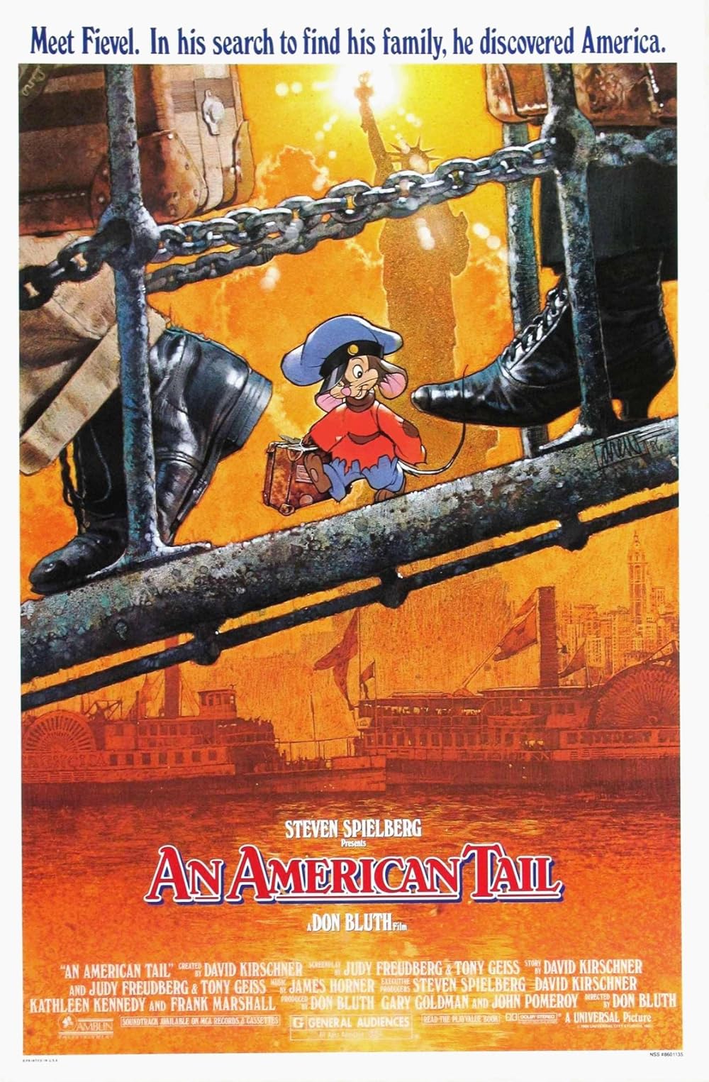
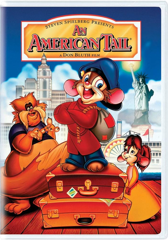
I love Drew Struzan's work, and his theatrical poster for 1986's An American Tail is one of my all-time favourite movie posters. The striking image of immigrants arriving in 19th century New York City, amidst the warm glow of a golden sunset, with the newly erected Statue of Liberty silhouetted in the background, welcoming Fievel, and the human newcomers on either side of him, to America. It's a powerful poster that perfectly sums up the premise of the film.
The DVD cover art tries to convey the same message, but I feel it lacks the finer details and visual punch of Struzan's poster. There are also a couple of anachronisms on the DVD cover, such as Tanya sporting her older teenaged appearance and outfit from Fievel Goes West, as well as the Statue of Liberty being depicted with its current green patina, rather than its original copper hue.
Fun fact: Struzan's poster is based on an actual photo of the Statue of Liberty's unveiling in 1886.
Valis III
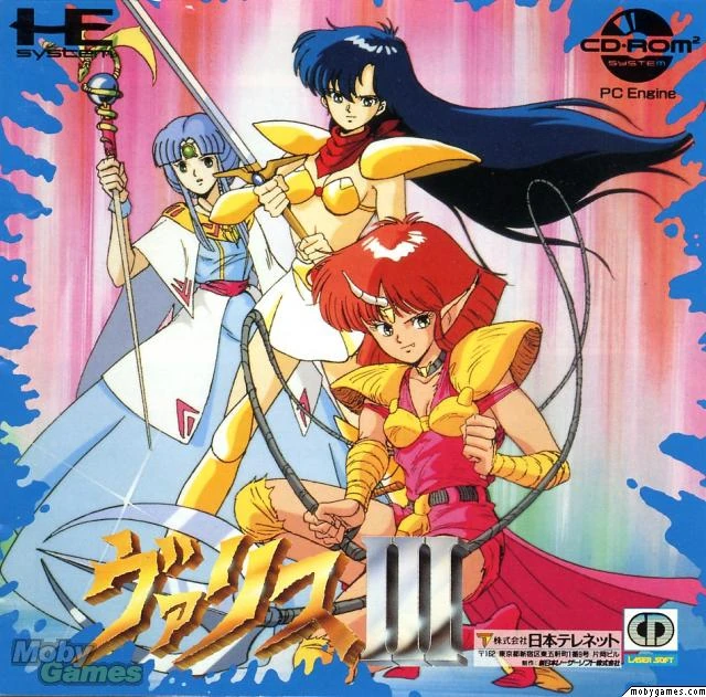
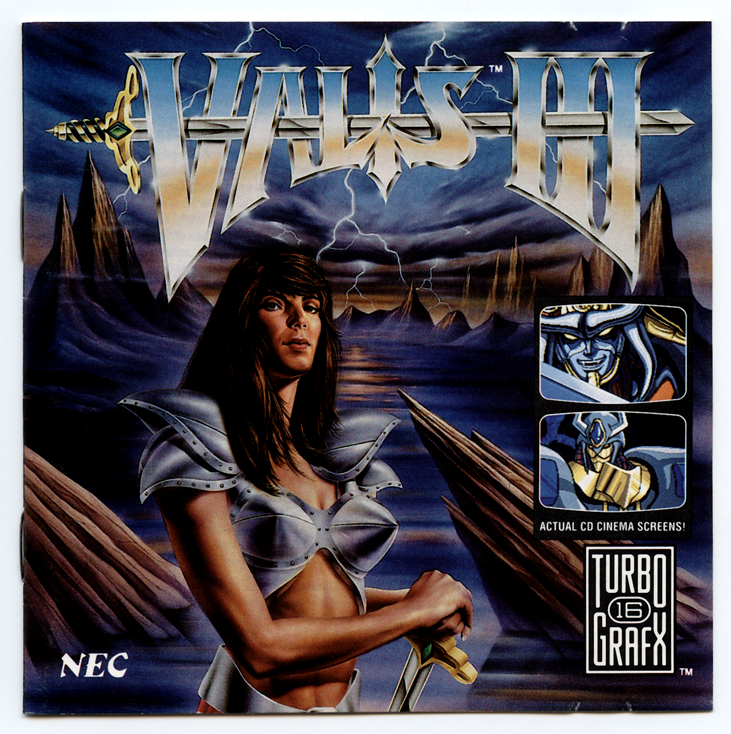
I'm a sucker for the unique artistry of manga and anime, so I'm obviously biased in favour of the original Japanese cover art for 1990's Valis III. All three of the game's teenaged protagonists, Yuko, Valna, and Cham, are front and centre, sporting accurate outfits to those worn by their in-game sprites.
The North American cover, on the other hand, opts for a grittier, more realistic look. Yuko is now the sole protagonist on display, and she's been reimagined as a middle-aged woman of European ancestry, rather than a teenaged girl of Asian descent. Her outfit has also received a metallic makeover, for some reason. Honestly, I feel the North American artwork is better suited for a hard rock vinyl album cover, rather than a video game.
Jurassic Park
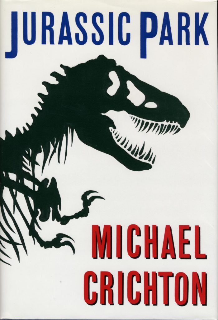
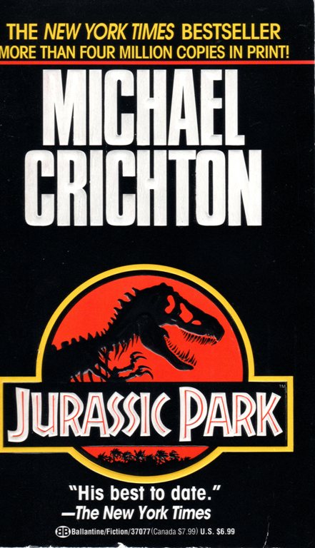
When it comes to Jurassic Park, I feel Michael Crichton's original 1990 novel is far superior to Steven Spielberg's 1993 cinematic adaptation. Crichton's novel is a cautionary tale about the dangers of playing God. Spielberg's film is more about wowing audiences with the razzle dazzle of Hollywood magic. Both are good, but the former is clearly the better of the two, in my opinion.
Having said that, I prefer the novel's reprinted cover, which is a tie-in based on the movie's poster. While the T-rex skeleton is featured prominently on both, the logo from the film feels more visually striking and complete, with the typography, palm trees, and orange sunset. It's exactly how I'd imagine a logo for an amusement park featuring scientifically resurrected dinosaurs to look.
The Simpsons
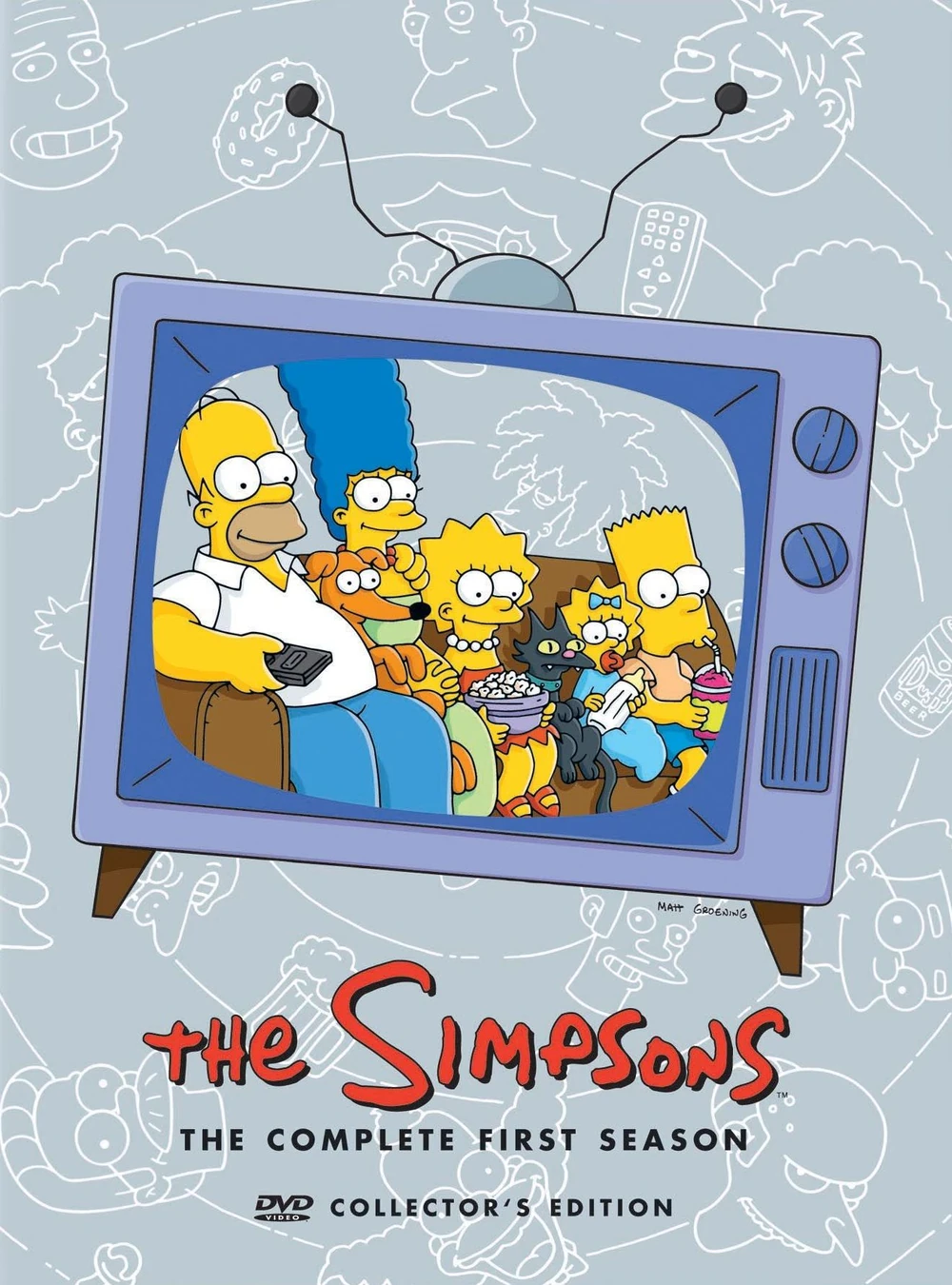
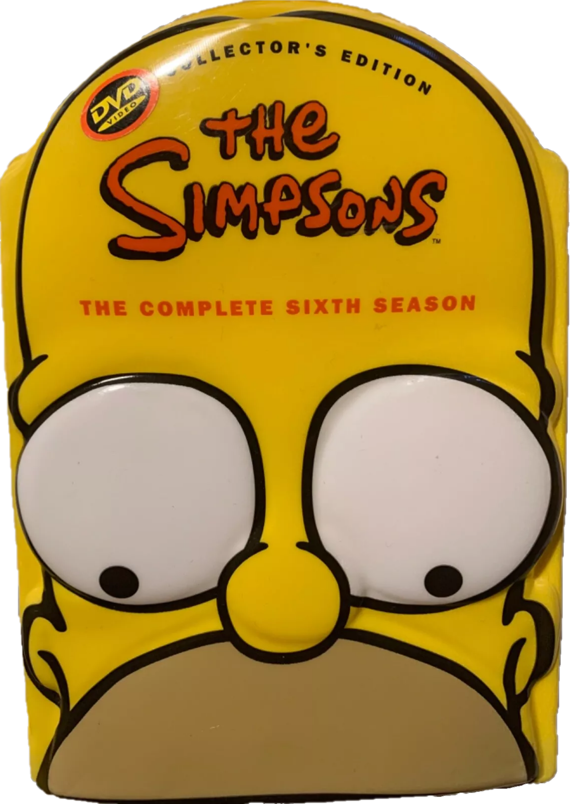
Here, we have the two variants of DVD covers for 1989's The Simpsons. The first batch came in your standard box set packaging and featured the Simpsons experiencing comical mishaps while sitting on their couch. The next batch switched things up drastically with molded 3D character heads for the covers.
While I applaud the creativity that went into this updated design, the heads were just...awkward, and looked out of place when stacked alongside the first batch of Simpsons DVDs on a shelf. Thankfully, future box sets were released in both models, giving consumers a choice between the two. Guess which style I didn't choo-choo-choose, going forward?
The Legend of Zelda: Spirit Tracks
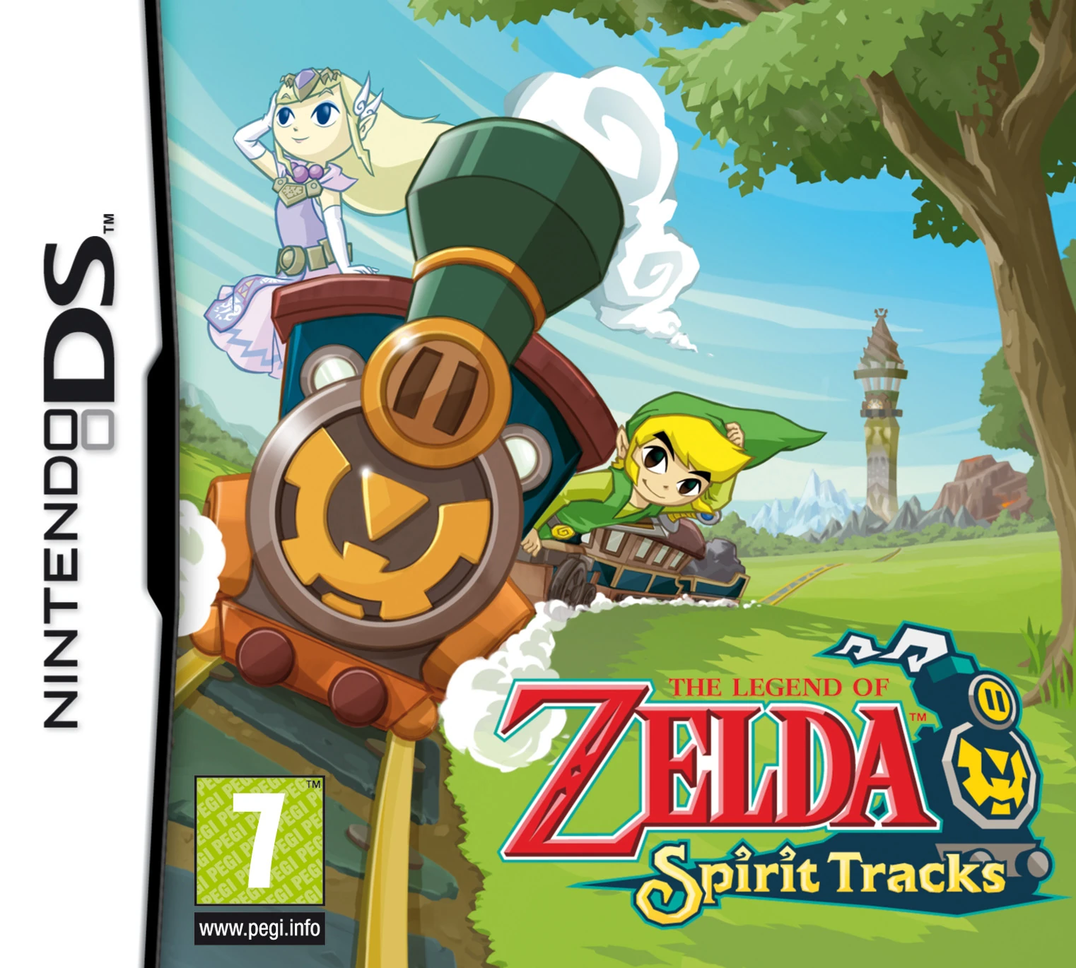
Our last stop for today is 2009's The Legend of Zelda: Spirit Tracks, which featured the same cool cover art in every region but North America. Honestly, I much prefer the international cover. We have Link driving his locomotive, a core mechanic of the gameplay, across the lush green expanse of Hyrule Field. Princess Zelda's ghost riding atop the train, her ethereal hair blowing in the wind. Both protagonists smiling, enjoying their adventure together. You get a real sense of the fun that awaits you from this cover.
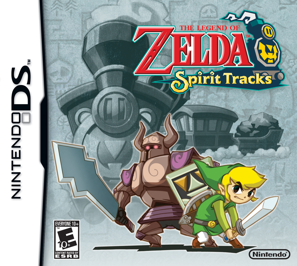
The North American cover was apparently going for an "edgier" vibe. Here, we have an angry Link in his battle stance, likely preparing to shout "Saaaaiyah!!!!" at the top of his lungs. Princess Zelda's ghost is only represented in the form of a bulky, armoured Phantom she's possessing. Link's locomotive is a mere afterthought on this cover, relegated to the colourless background. Not bad if you prefer action-oriented imagery, but also not my cup of tea.
Fun fact: Back in the day, I opted against purchasing Spirit Tracks here in Canada, as I'd planned to import an international copy, given the DS's region-free status. Unfortunately, I never got around to doing so.
I'll leave it there for now but will cover more covers soon! Do you have any thoughts on this post? If so, feel free to reach out by leaving a comment, dropping me a line, or signing my guestbook to share your opinions on this or any other topic. Also, feel free to press the "like" button if you enjoyed this post, as "likes" help me gauge audience interest in the content I post. After all, I don't want to bore anyone, ha-ha. Until next time, love, peace, and chicken grease!
Posted in "Random Encounters" on Tuesday, August 20, 2024.