More Cover Art Comparisons
"To create a memorable design, you have to start with a thought that's worth remembering." - Thomas Manss
Welcome back to Cover Art Comparisons! I meant to post this yesterday but had to adjust the article. Anyway, we have another batch of covers to cover, so let's stop talking and just get going. Vámonos!
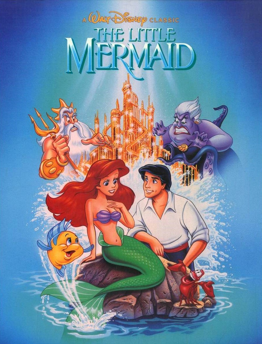
The Little Mermaid
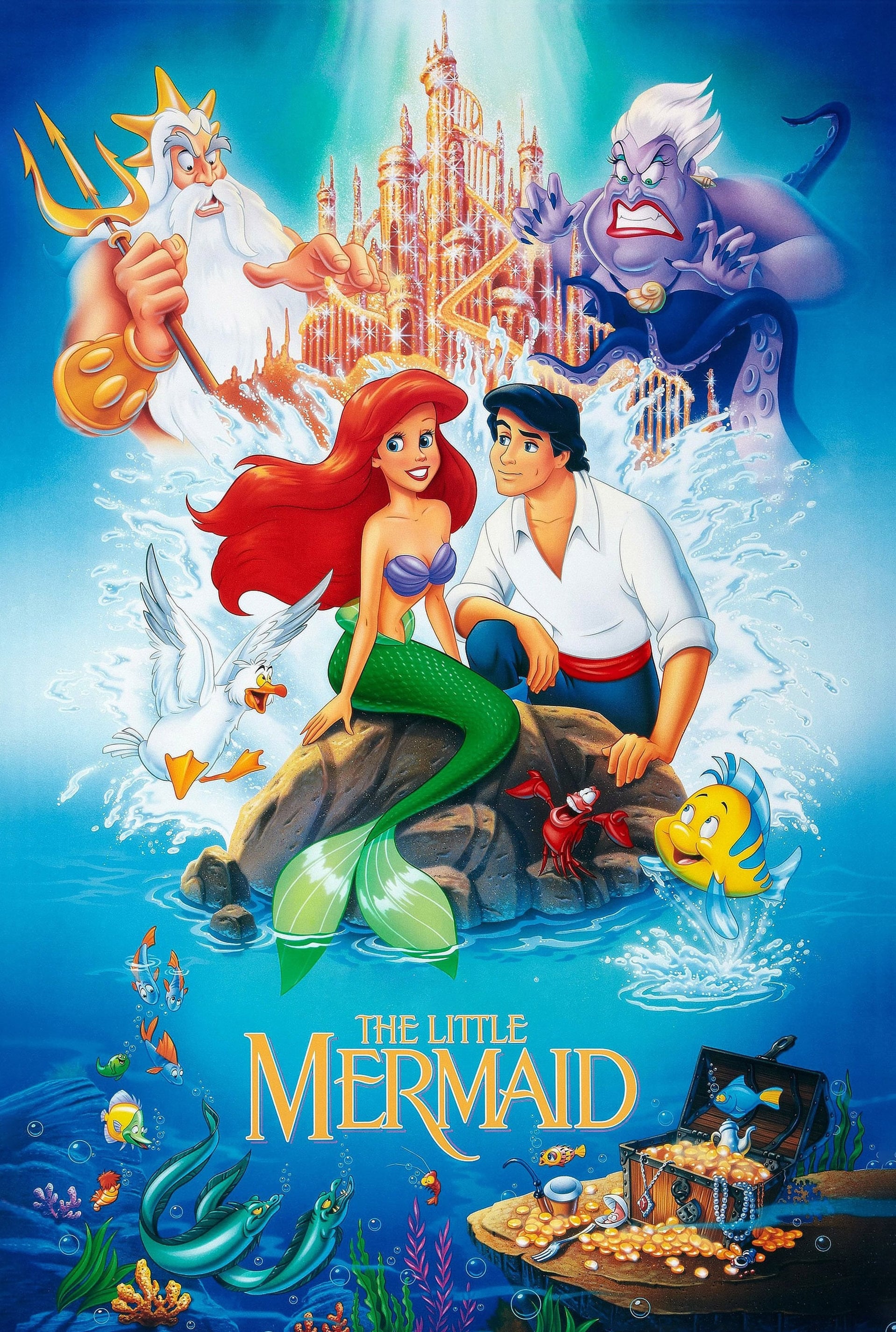
Since we kicked off our previous batch of posters and covers with a Bluth flick that dethroned Disney, let's kick off this batch with a Disney flick that dethroned Bluth. Both the theatrical poster and VHS cover art for 1989's The Little Mermaid reference the famous Little Mermaid statue in Copenhagen via their depictions of Ariel sitting on a rock in the sea. From a quick glance, both appear nearly identical, but...look closer. The poster has additional characters, like Scuttle and the eels, as well as cool underwater details, like a school of fish and a treasure chest. The artwork in general is of a higher quality, such as the illustrations of the characters, or the more detailed artistic flourishes, like the light, shadows, and colours. The only element that feels off is Eric's facial expression. He's supposed to be exuding romantic interest in Ariel, but to me, he seems unsure of whether he wants to pursue a relationship with her.
With the cover, everything appears more cramped and less refined. This could be due to the artist rushing to meet a deadline or having less real estate to work with in this medium. For example, Eric's proportions seem off. His right knee and left hand are hidden from view, while his right hand looks stiff or injured, as if Ursula crushed his fingers for angering her. Having said that, I do feel Eric's romantic gaze is more spot on and confident here, and I like that Ariel is facing him rather than looking the other way. However, I question why her gaze appears directed towards...Sebastian. Perhaps she's seeking the crab's approval? While I'm a fan of both works of art, I must give the victory to the poster for all the reasons stated above.
McDonald's
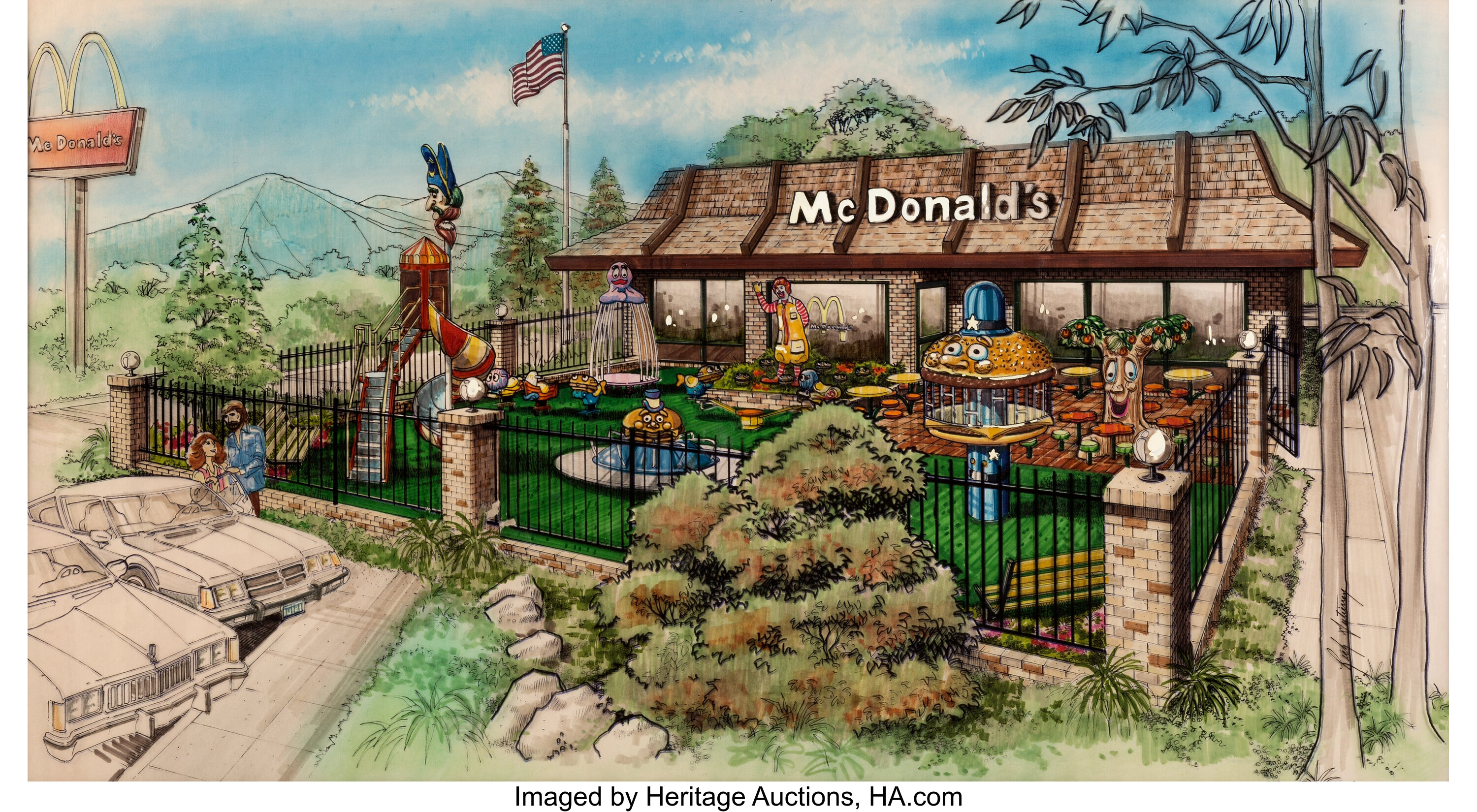

While not a creative work of fiction, McDonald's is nonetheless a prime example of pop culture Americana, so I feel it deserves a place on this list. The first architectural illustration depicts the uniformed look of McDonald's restaurants in the 1980s and 1990s, complete with the playground featuring Ronald McDonald and all his long-lost buddies. This house design gives off a cozy vibe, and the presence of the Hamburglar, Birdie, Grimace, the Fry Kids, etc., adds a touch of childhood wonder and magic to the fast-food chain.
The second architectural illustration depicts the uniformed look of McDonald's restaurants today, which goes for that "modern", "hip", and "trendy" gentrified look that's all too common in architecture these days. No coziness. No childhood wonder. Just a place to grab a coffee to go or a quick bite to eat. What you see is what you get from this box design. I honestly prefer the more whimsical McDonald's architecture from the 1980s and 1990s. I also miss McDonald's former mascots from this era, as they were both fun and funky.
Phalanx
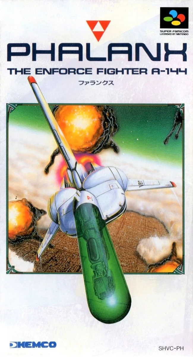
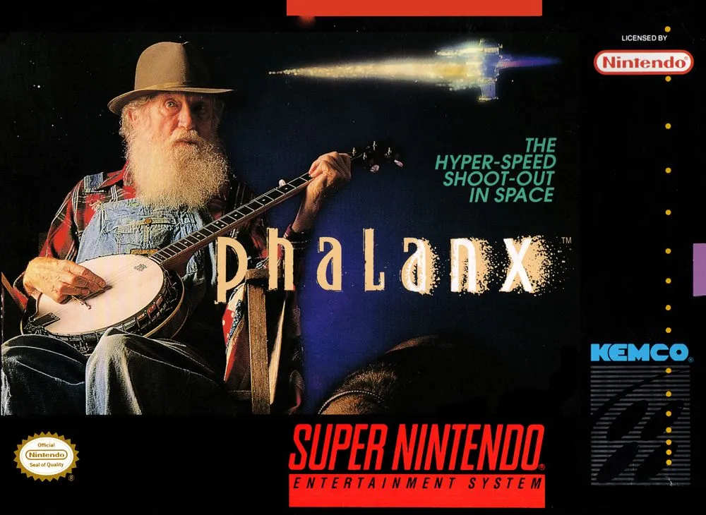
This next entry is an interesting one. Here, we have the 1991 shoot 'em up, Phalanx, which features drastically different cover art between regions. Both the Japanese and European covers present a faithful depiction of the game's sci-fi subject matter, focusing on a starship engaged in an arial dogfight in the skies high above an extraterrestrial cityscape. This perfectly sums up the premise of the game, clearly letting gamers know of the experience that awaits them.
The North American cover features an elderly hillbilly strumming on a banjo, which has absolutely nothing to do with the premise of the game, nor does it offer gamers any clues of the experience contained within. Strangely, this unorthodox cover works. The story behind the mysterious hillbilly is quite fascinating. The Coles Notes version is that the ad agency tasked with designing the North American cover art wanted Phalanx to stand out on store shelves. So, they went with a hillbilly playing a banjo, as such an unusual cover would surely cause any passersby to do a double take. It worked, as many gamers, me included, have never forgotten that iconic hillbilly or his banjo. So, for being more memorable than the actual game it represents, the North American cover takes the win!
The Lord of the Rings
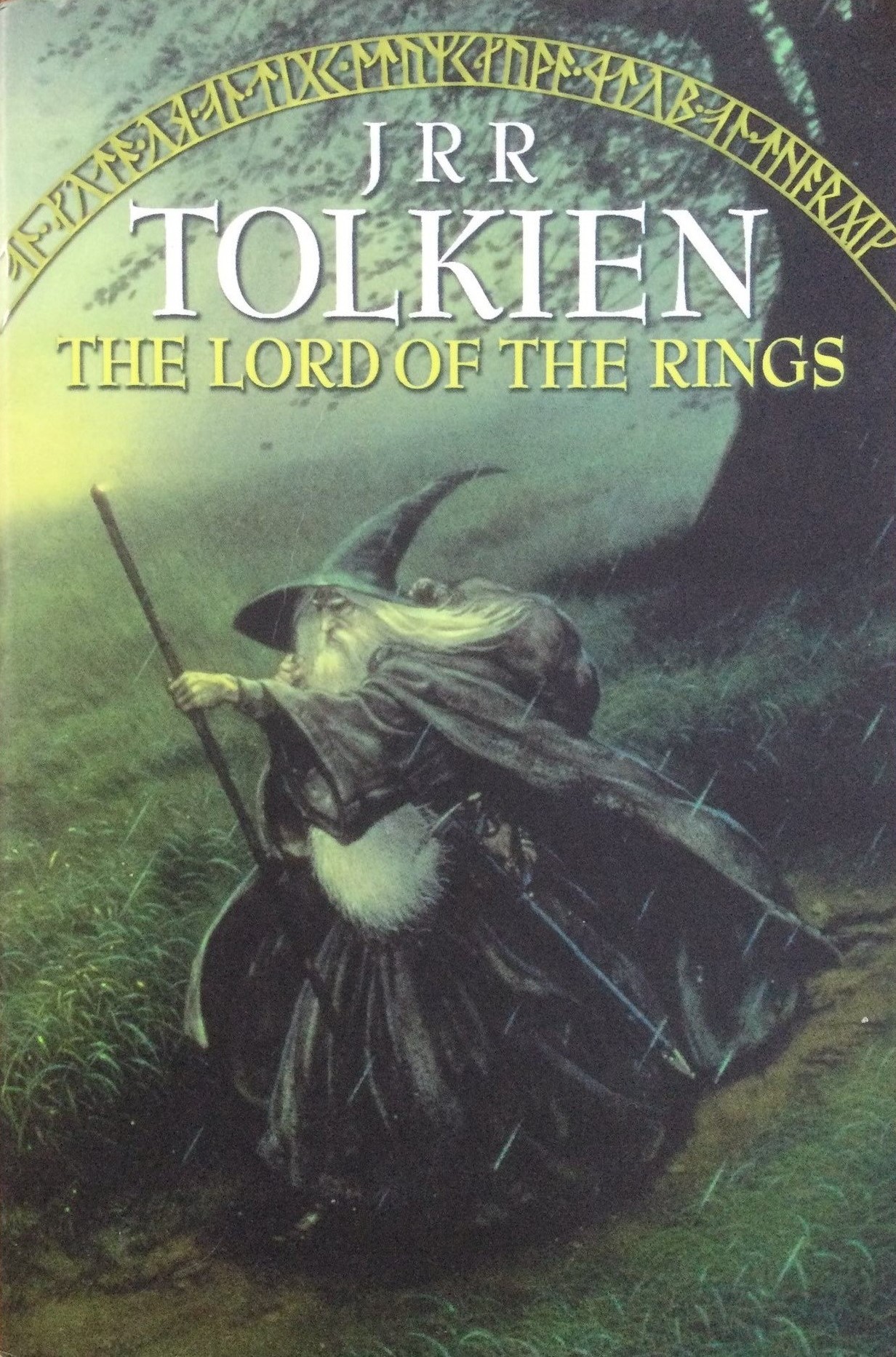
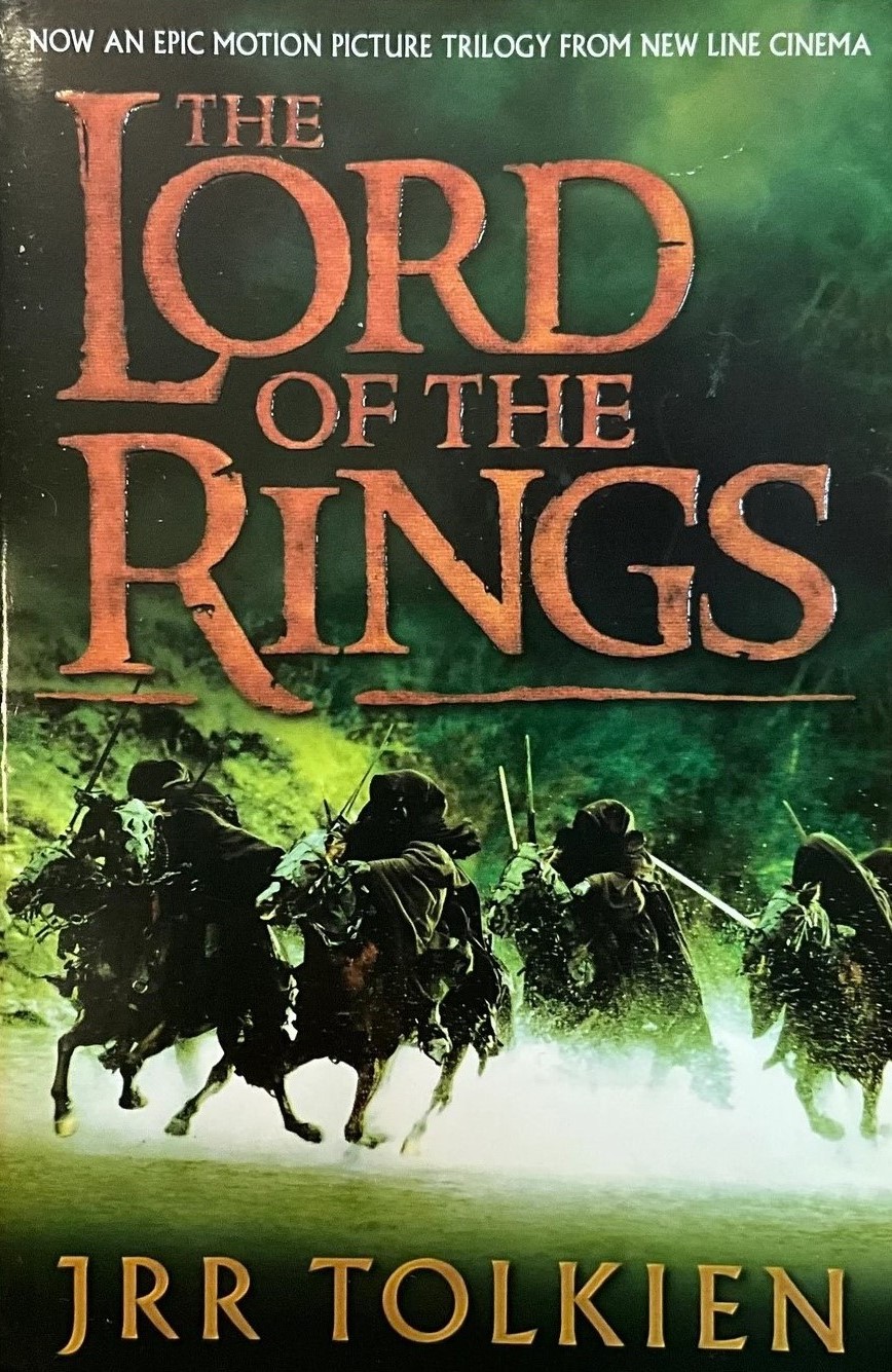
Next up, two book covers for J.R.R. Tolkien's epic 1954 high fantasy, Bible-sized novel, The Lord of the Rings, one featuring an illustration by famed Middle-earth illustrator, John Howe, and the other featuring a tie-in film still from Peter Jackson's 2001 cinematic adaptation, The Lord of the Rings: The Fellowship of the Ring. Howe's cover depicts Gandalf hiking through the wilderness on a rainy day. The tie-in cover depicts a movie scene of the Ringwraiths riding forth in their pursuit of Frodo.
Honestly, I don't have much to say about either, as both are fine and neither feature an overabundance of details to go over. For the tie-in version, I feel the theatrical poster for The Fellowship of the Ring would've made a better cover than a photo of the Ringwraiths, as the poster features all the principal characters. I prefer the Gandalf cover for featuring one of the novel's most important protagonists as well as for being a hand-drawn illustration rather than a random screenshot from the movie.
Fun fact: Toronto's long-departed World's Biggest Bookstore sold both variants of The Lord of the Rings. I initially purchased the movie tie-in cover but immediately regretted my decision and asked if I could exchange it for the Gandalf cover. The World's Biggest Bookstore obliged, which goes to show how cool they were to their customers.
Golden Axe
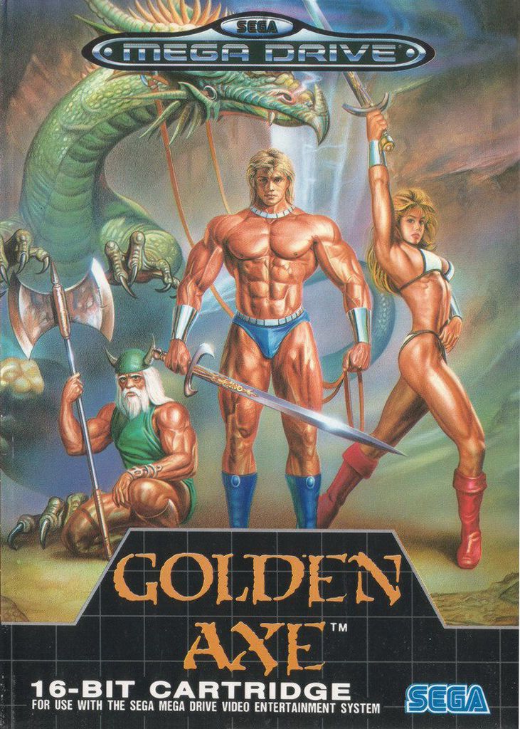
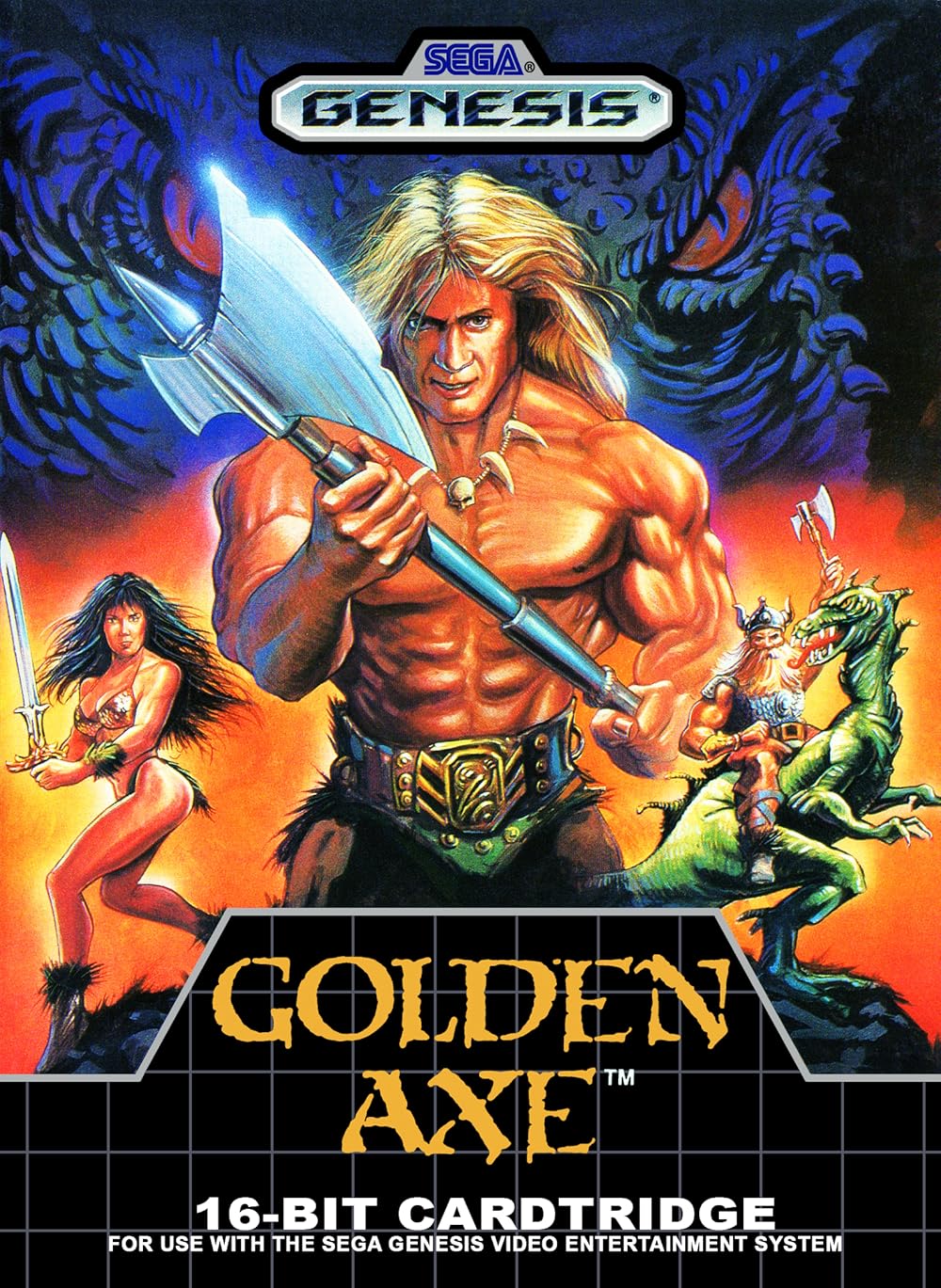
As we're already on the topic of medieval high fantasy, let's wrap up today's batch of covers with a look at 1989's Golden Axe. The game's three protagonists, Gilius Thunderhead, Ax Battler, and Tyris Flare are the focal point of both covers. The European and Japanese art depicts Gilius, Ax, and Tyris faithfully to their in-game sprites, with all three receiving equal prominence on the cover. The Japanese and European art also seems to be of a higher quality than their North American counterpart, bearing a striking resemblance to the art style featured on the theatrical poster for 1982's Conan the Barbarian. This makes sense, given that Golden Axe appears to draw plenty of inspiration from that gritty film.
In contrast, the North American cover is primarily focused on Ax, with Tyris and Gilius relegated to the background. All three of them have also been given makeovers that differ from their in-game appearance. Gilius is now younger and has decked himself out in heavy chainmail armour. Ax and Tyris have been to a hair salon as well as the boutique, choosing to rock flexible and breathable, animal furs, for that Tarzan chicness. Of note, Ax is also erroneously depicted wielding a battle axe, rather than his in-game sword. Isn't it ironic that his name is "Ax Battler" yet he fights with a sword? Anyway, I prefer the more-accurate European and Japanese approach to the cover art, and appreciate all three characters being portrayed as equals, rather than having one stand above the other two.
That's it for now, but I'll be back with more covers to cover, soon! Do you have any thoughts on this post? If so, feel free to reach out by leaving a comment, dropping me a line, or signing my guestbook to share your opinions on this or any other topic. Also, feel free to press the "like" button if you enjoyed this post, as "likes" help me gauge audience interest in the content I post. After all, I don't want to bore anyone, ha-ha. Until next time, love, peace, and chicken grease!
Posted in "Random Encounters" on Monday, August 26, 2024.