Cover Art Comparisons Deep-Six
"Marketing should never be just a blunt instrument." - Terry O'Reilly
Three months after our special Donkey Kong Edition, we're finally back with another numbered entry of Cover Art Comparisons! "Deep-Six"...hmm, I'm really scraping the bottom of the barrel for number-related titles now, aren't I? Anyway, it's been quite awhile since we last compared some covers, so on with the show!
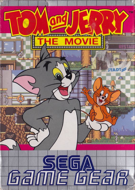
Tom and Jerry: The Movie, 1993 - "Big City Skyscraper" vs. "Friends to the End" Covers
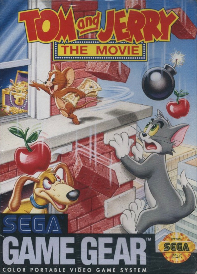
First up, we have a pair of covers for the 1993 Tom and Jerry: The Movie video game! The North American version portrays Tom scaling up the side of a big city skyscraper in pursuit of Jerry, who darts along the building's ledge, clutching a treasure map. The chest containing said treasure is visible through an opened window, while Ferdinand, the skateboarding dachshund, glares up at the pair from a window below. Somehow, Jerry's raining down bricks, bombs, and apples upon Ferdinand and Tom, with the frightened feline realizing the world of hurt he's imminently in for. A really cool design that perfectly captures the cartoony antics of the furry frenemies. The artwork is nicely detailed with plenty of artistic flourishes, such as shading, value, chiaroscuro, and atmospheric perspective.
The European cover opts to depict Tom & Jerry as the friends to the end sung about in the movie, as opposed to their adversarial relationship in the video game itself. The strange bedfellows both appear to be in an equally jovial mood, with Jerry feeling safe and secure enough to sit in Tom's opened paw, waving at the game's potential buyers. Rather than the big city backdrop of the North American cover, the background of the European artwork is simply comprised of multiple screenshots of in-game footage. This design is also lacking in the artistic flourishes department. As a result, the North American cover is my pick for Round 1!
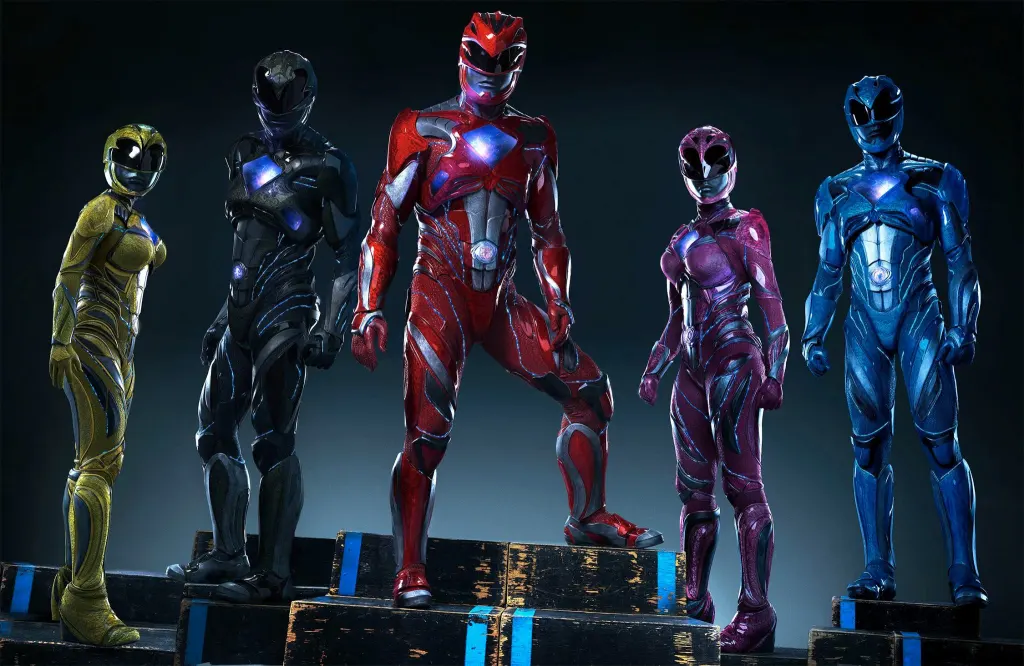
Mighty Morphin Power Rangers, 1993 - "Spandex" vs. Power Rangers, 2017 - "Armoured" Uniforms
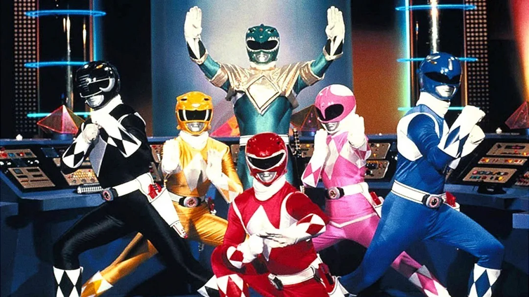
Next, we have the uniforms worn by the original 1993 Mighty Morphin Power Rangers and those worn by the rebooted 2017 Power Rangers! The 1993 Rangers are decked out in matching diamond-patterned spandex uniforms, complete with accessories including gloves, boots, holstered belts, and visored helmets with metallic mouthpieces. The only notable differences of these designs are their colours, ornamental helmet designs, and the additional miniskirt and breastplate worn by the Pink and Green Rangers, respectively. It's a cool uniform that provides maximum flexibility for all those high-flying flips and martial arts moves performed by the Rangers. Fashionable and comfortable.
As with all other aspects of this melodramatic, dead-on-arrival revival, the uniforms worn by the 2017 Rangers completely shun practicality in favour of flashiness. This is quite ironic, considering these "edgier" and "hipper" armoured designs feel naked in comparison to the 1993 Rangers' spandex uniforms, lacking their stylish diamond-patterns and all the cool accessories, save for the helmets, which befitting of the reboot, are much more alien in appearance. On top of being real eyesores, these metallic uniforms seem rather ridged and difficult to manoeuvre around in. For me, substance always trumps style, so this one's a no-brainer; the 1993 Rangers' uniforms are my picks for Round 2!
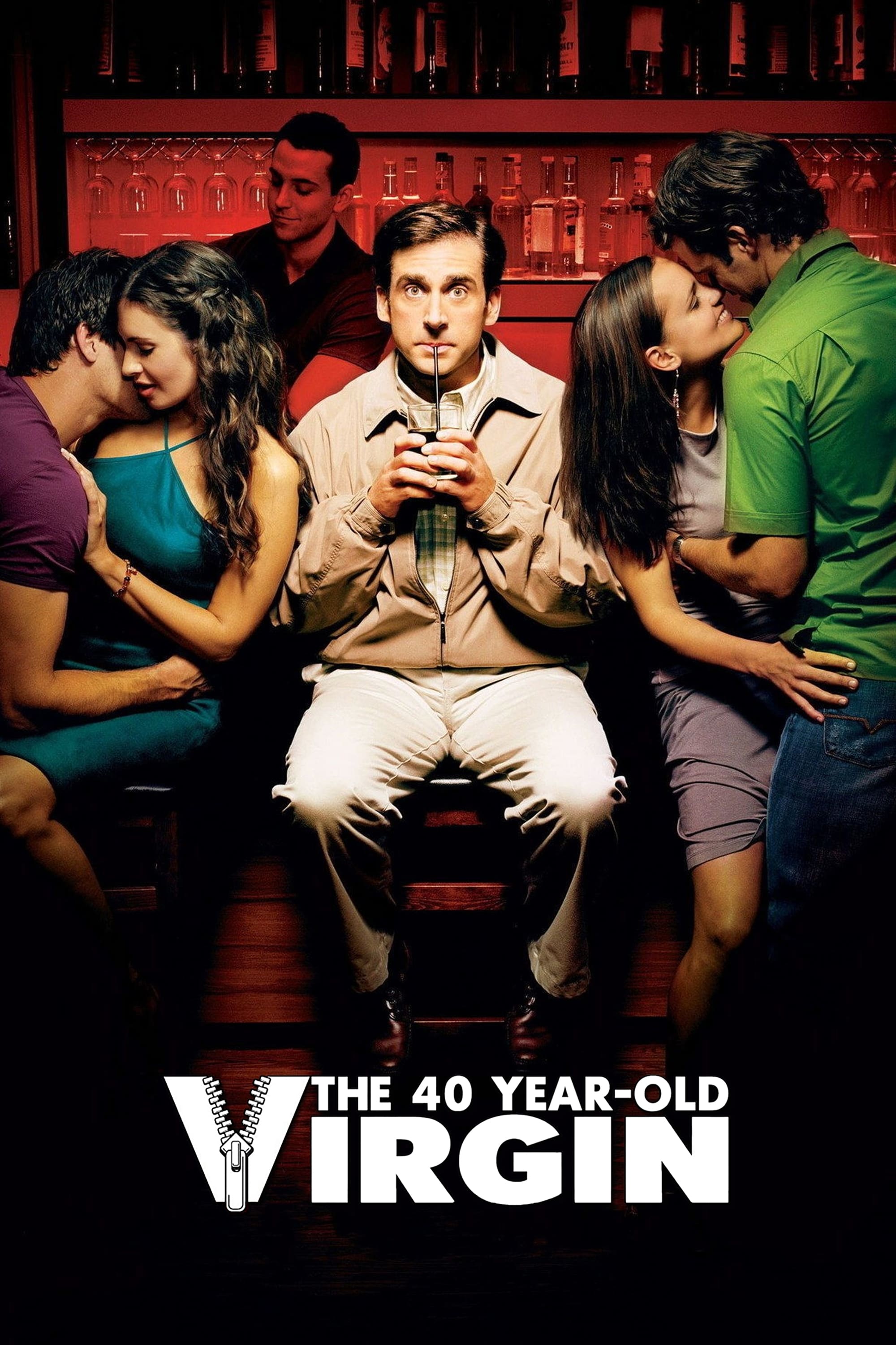
The 40-Year-Old Virgin, 2005 - "Headshot" vs. "Nightclub" Posters
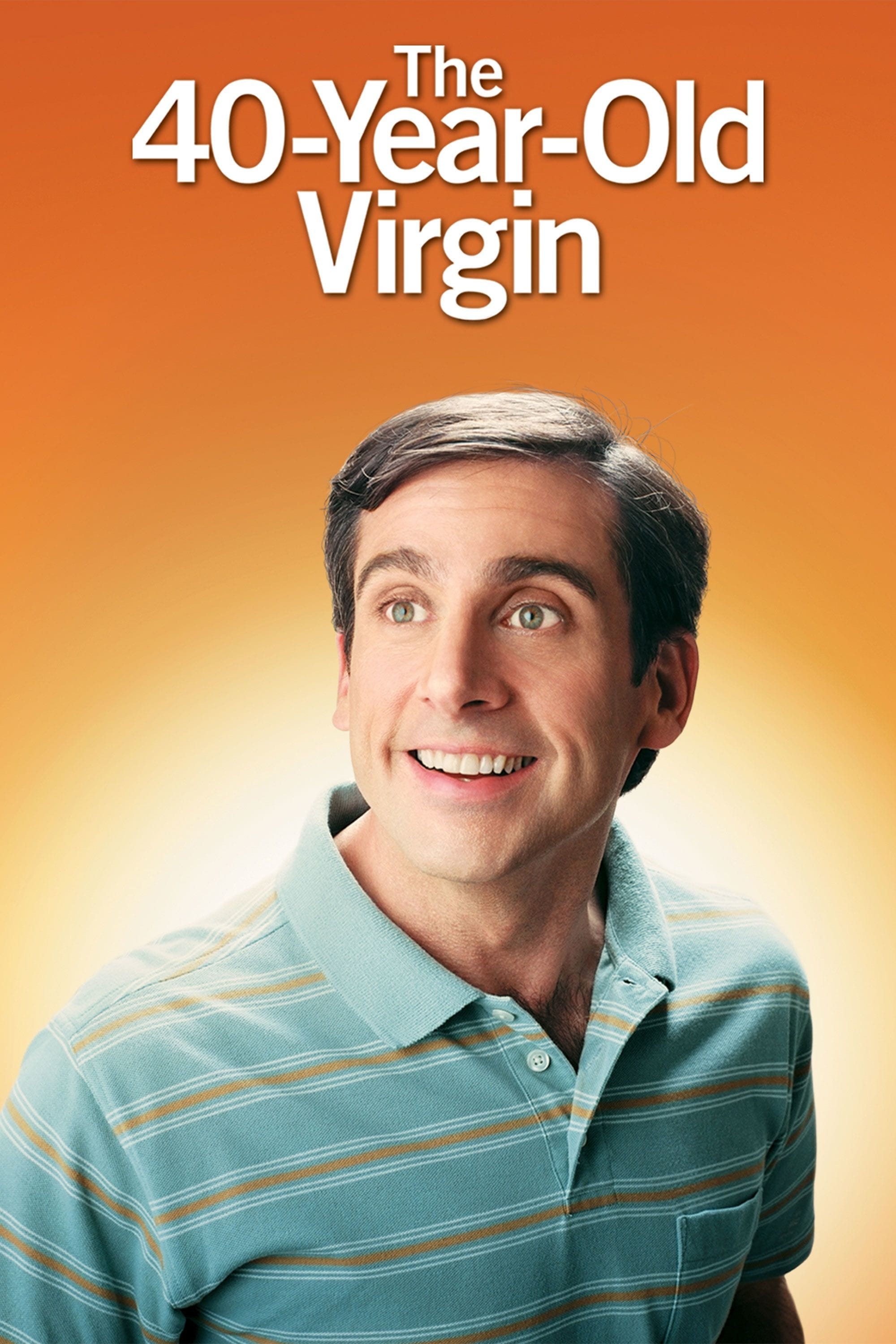
Here, we have a pair of movie posters for The 40-Year-Old Virgin! The first is a simple headshot of Steve Carrel grinning awkwardly into space while wearing a striped blue and brown polo shirt within an orange void. That's it. As with the guitar poster for 2010's Scott Pilgrim vs. the World or the belly button poster for 1999's American Beauty, there's an enigmatic quality to this minimalistic design that refuses to reveal any hint of the film's plot, other than it revolving around an awkward, middle-aged virgin who apparently shops for shirts at Old Navy. It's funny, because I distinctly remember seeing this poster plastered all over Toronto in the lead-up to the film's summer 2005 release and, being unfamiliar with Steve Carrel's work at the time, I couldn't make heads or tails as to what exactly it was advertising. Cologne, perhaps? Of note, this design was parodied by the poster of 2009's Fanboys.
The second design is much more detailed with its storytelling, depicting the middle-aged Carrel awkwardly sipping a drink from a straw at a nightclub's bar, sandwiched between a pair of twenty-something girls who are passionately making out with their boyfriends, all while the bartender happily serves up a drink in the background. You really get a sense of how out-of-place the middle-aged virgin feels, surrounded by young lovers while hopelessly single. He's essentially a fifth wheel; an outsider looking in at a real cool world he desperately wishes to be part of. While I've long found peace in bachelorhood, I remember a time when I'd go clubbing with friends and would feel so out of place being the only person in those deafeningly loud nightclubs who wasn't in a relationship or on a date, so I can certainly relate to Carrel's character, awkwardly sipping his drink alone while surrounded by passionate couples. As such, the more-detailed second poster is my pick for Round 3!
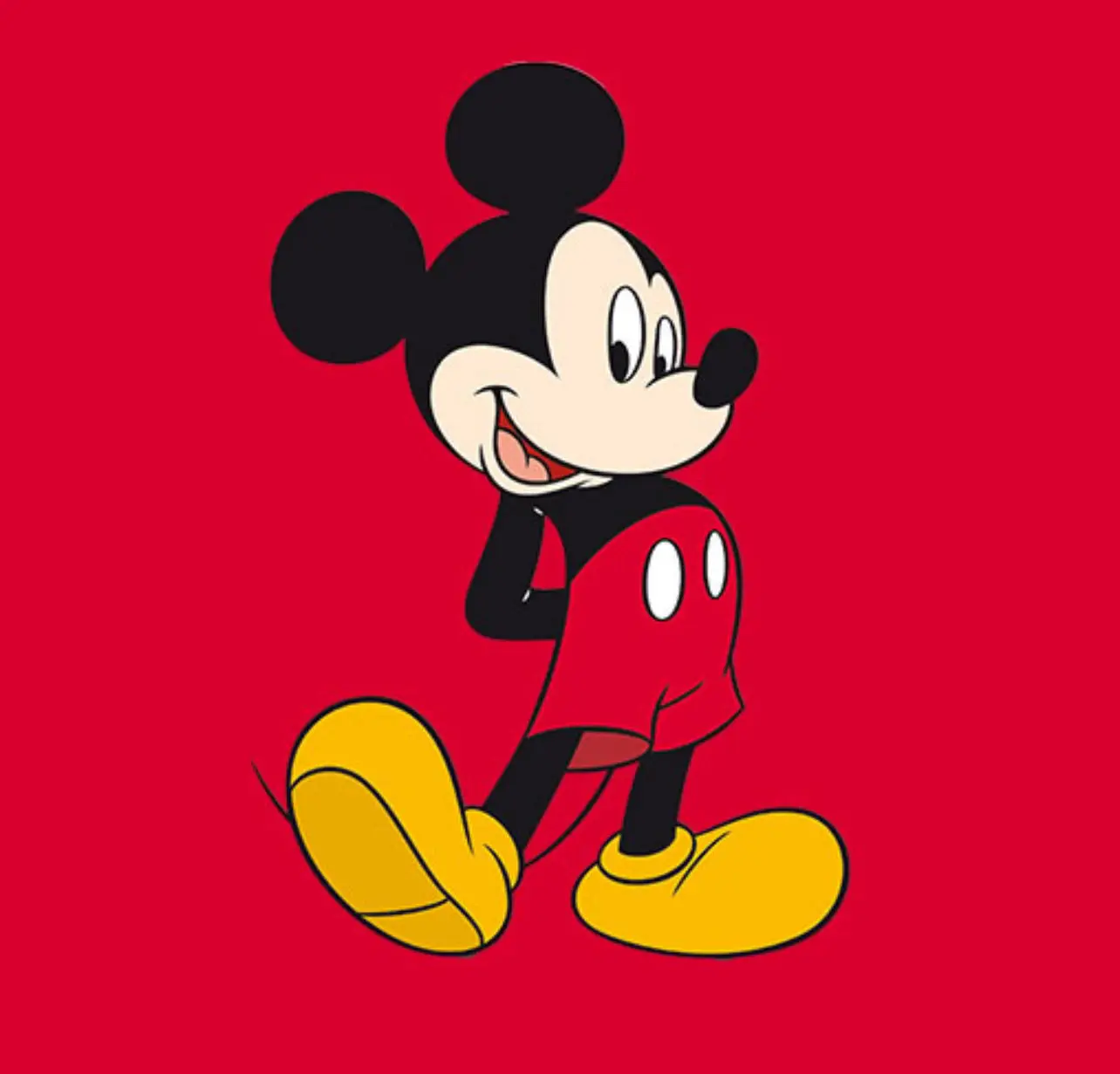
Original Mickey Mouse, 1928 - "Mischievous Mouse" vs. Updated Mickey Mouse, 1939 - "Reformed Rodent" Designs
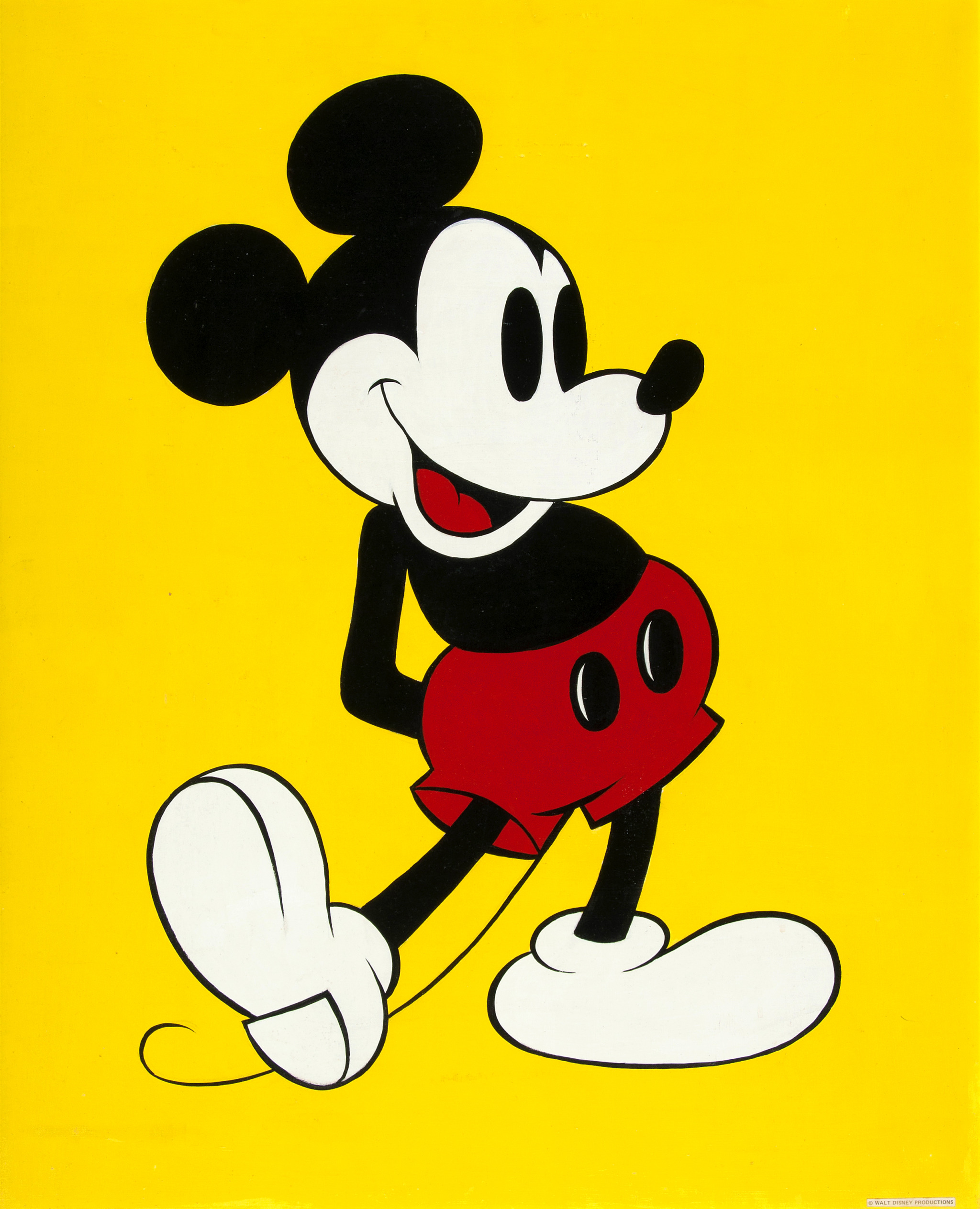
Moving on, we have Ub Iwerks' original 1928 and Fred Moore's updated 1939 designs of Mickey Mouse! It should be noted that the two versions of Mickey differ in more than just the looks department, having completely different personalities. The original, now-public domain version of Mickey, designed by Ub Iwerks (Disney often forgets to mention him), is as charming as he is iconic; the round ears, black bead eyes, buttoned shorts, and rubber hose limbs are all representative of the adventurous, mischievous, and sometimes mean-spirited rodent that Mickey once was back in the 1920s and 1930s. He's the antithesis of the sanitized, modern-day Disney, adding to his coolness, charisma, and charm.
While similar in appearance, from the round ears to the buttoned shorts, Fred Moore's updated and still-copyrighted redesign of Mickey brought along with it a drastic change in the mouse's personality. This saccharine and reformed "nice guy" version of Mickey is rather dull when compared to the original, rebellious rodent from the Steamboat Willie era. There's a reason why so many people, including celebrities like Dakota Fanning, continue wearing shirts emblazoned with Iwerks' version of Mickey on them; he's simply the cooler mouse in the house. Another non-brainer: original 1928 Mickey is my pick for Round 4!
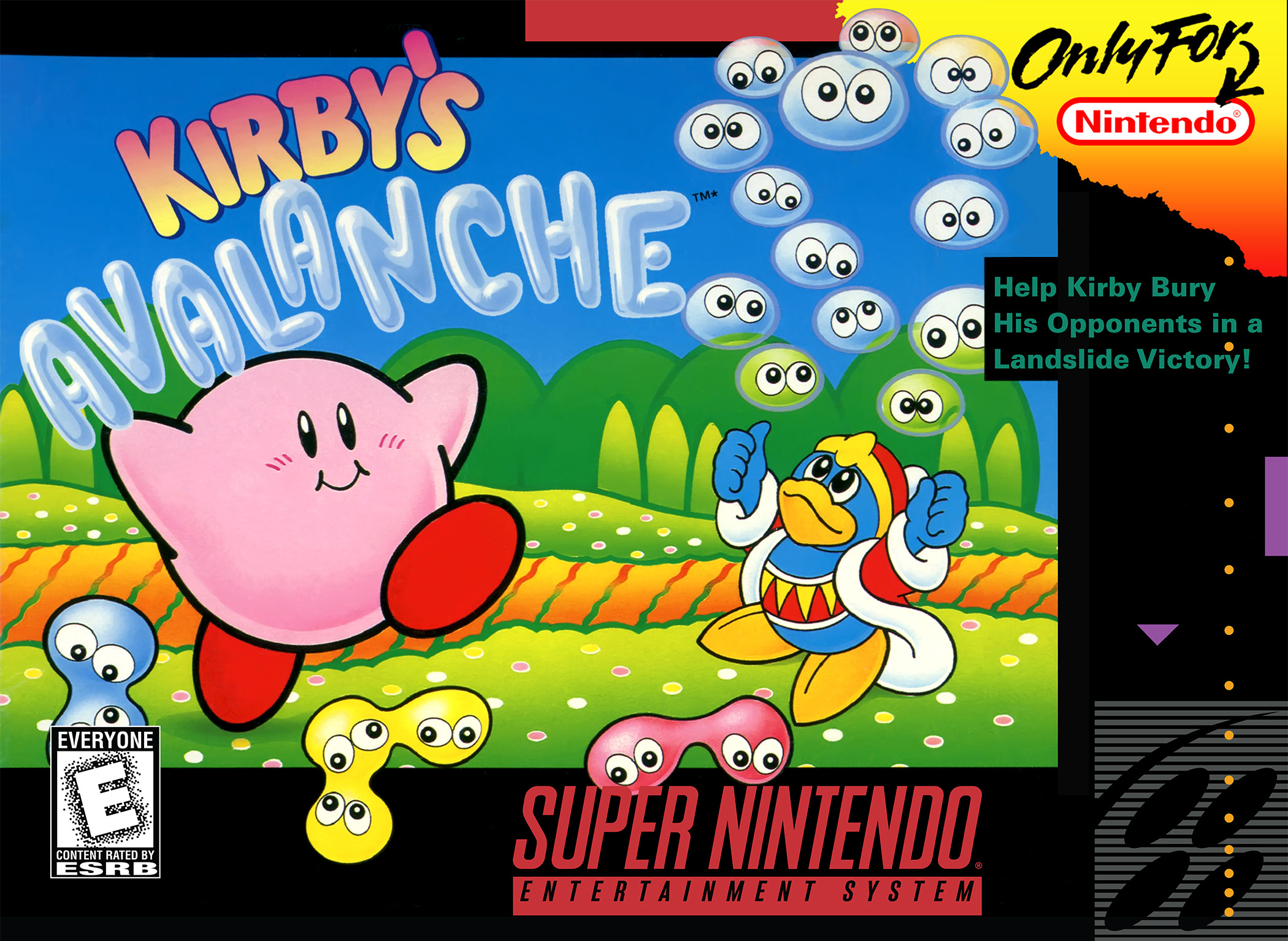
Super Puyo Puyo 2 and Kirby's Avalanche, 1995 - "Teen Anime Girl" vs. "Cream Puff Daddy" Covers
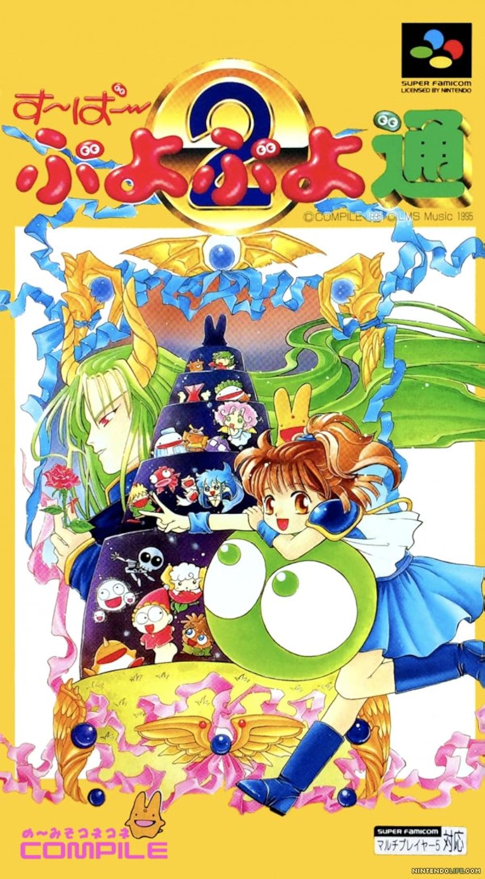
Finally, we have the same iconic puzzle game under two different names! The Japanese cover of Super Puyo Puyo 2 features teenaged spellcaster, Arle Nadja, leaning against a giant green Puyo, flashing the peace sign with her fingers, while her pet bunny(?), Carbuncle, happily rests atop her head. Behind Arle, Carbuncle, and the giant green Puyo is a massive spiral tower resembling Pieter Bruegel's Tower of Babel paintings, upon which the game's wacky cast of characters stand. Behind the tower, dominating most of the background, is the game's villain, Satan, clutching a red rose while his long green hair flows in the wind. The Japanese design has plenty of artistic flourishes, including shading, value, chiaroscuro, and atmospheric perspective. It's one cool cover.
When Super Puyo Puyo 2 was released in North America, it was reskinned as a Kirby game, thus sidelining the original anime cast, a common practice at the time. The North American cover features a scene of Kirby and King Dedede hanging out with various Puyos in Dream Land; a pair each of blue, yellow, and red, as well as multiple transparent ones. For some reason, the Puyos have been renamed "Blobs" in this version of the game. While undeniably cute and colourful, this simpler design tones down much of the artistic flourishes prominent in its Japanese counterpart. So, while I'm certainly fond of Kirby and his charming artwork, I feel Arle's anime cover packs more of an artistic punch, thus making Super Puyo Puyo 2 my pick for round 5!
That's all for now, but we'll be back with more Cover Art Comparisons...sooner rather than later (hopefully, haha)! Do you have any thoughts on this post? If so, feel free to reach out by leaving a comment, dropping me a line, or signing my guestbook to share your opinions on this or any other topic. To receive the latest updates on my work or to directly interact with my content ("likes" or comments), follow me on Neocities. Also, feel free to press the "like" button if you enjoyed this post, as "likes" help me gauge audience interest in the content I post. After all, I don't want to bore anyone, ha-ha. Until next time, love, peace, and chicken grease!
Posted in "Random Encounters" on Friday, April 25, 2025.