Cover Art Comparisons Halloween Special, A.D. 2025
"What is a man? A miserable little pile of secrets. But enough talk, have at you!" - Dracula, Castlevania: Symphony of the Night
It's been six months since our last installment of Cover Art Comparisons, but guess what? We're back with our second annual Halloween Special! This time around, I've spoiler-proofed each of my picks. To read them, simply hover your mouse cursor over the redacted aquamarine portion of text and then highlight it. So, are you ready to go on a ghost walk through the haunted streets and alleyways of popular culture? Well, let's go...
Ghost Beach, 1994 vs. 2010 vs. UK Covers
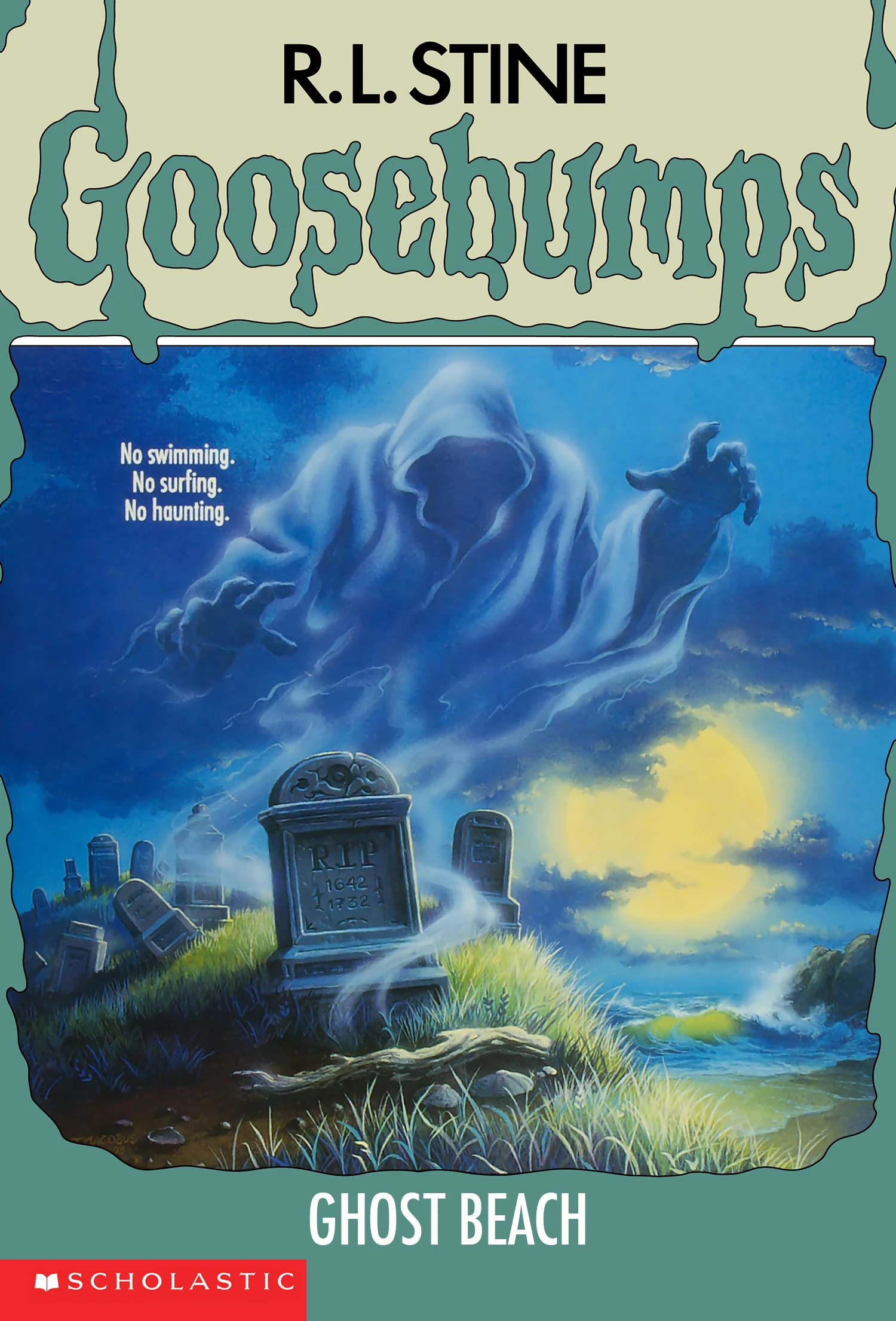
Let's kick off our ghost walk with a visit to Ghost Beach, one of R.L. Stine's classic Goosebumps books. The original 1994 cover, beautifully illustrated by Tim Jacobus, depicts a moonlit night at a secluded New England beach. The tranquil image of waves washing up against the seashore is being disturbed by a haunting scene at the neighbouring colonial-era cemetery: the cloaked ghost of an anonymous Puritan rising from the grave. According to the dates on their headstone (1642-1732), this individual was 90-years-old at the time of their passing, so I can't imagine a soul that achieved such longevity in this world would have any sort of unfinished business preventing their departure to the great beyond, but I digress. This cover has an air of realism to its design and is rich with all sorts of cool details, such as the derelict state of the cemetery, the clams/oysters/mussels (I can't tell them apart) partially buried in the sand, the reflection of moonlight cast upon the Atlantic, and the waves and seafoam striking the rocks and splashing the shoreline. The tagline reads, "No swimming. No surfing. No haunting." From what I've been told, the North Atlantic is far too cold to swim or surf in for more than a few minutes at a time, so I'm not sure how comfortable the haunting would be there.
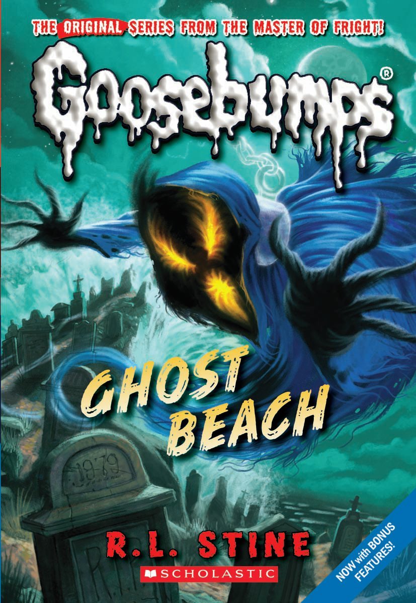
The 2010 reprint cover retains the original's supernatural surf and turf motif while ditching its air of realism in favour of a more stylistic approach to the artwork. Whereas the New England beach and colonial-era cemetery originally neighboured each other, they're now merged together, with headstones extending all the way to the seashore, resulting in coffins floating in the Atlantic (add, "No polluting." to the list of beach rules). The cloaked ghost no longer appears to be that of a colonial era Puritan, but rather, a Poe from The Legend of Zelda: Ocarina of Time wearing a chain as a fashion accessory. The new date on their headstone (1979) suggests this individual succumbed to disco fever. There's no tagline detailing the beach's rules this time around, though I can't imagine anybody would want to swim, surf, or haunt at this beach with those coffins bobbing about the water.
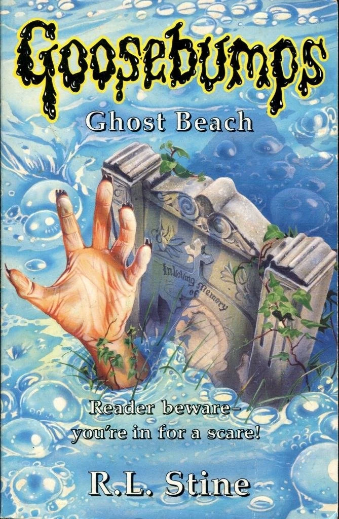
The UK variant brings back the original cover's air of realism but ditches its supernatural surf and turf motif altogether, focusing instead on a headstone soaking in a hot tub. Rather than a ghost, we now have a zombie relaxing in the steamy, bubbly goodness. I'm not sure what this cover has to do with ghosts or beaches, but it certainly makes me long for a therapeutic dip in a hot tub right about now.
My pick: When it comes to Goosebumps covers, there's no substitute for Tim Jacobus!
King Kong, 1933 vs. 1933 Posters
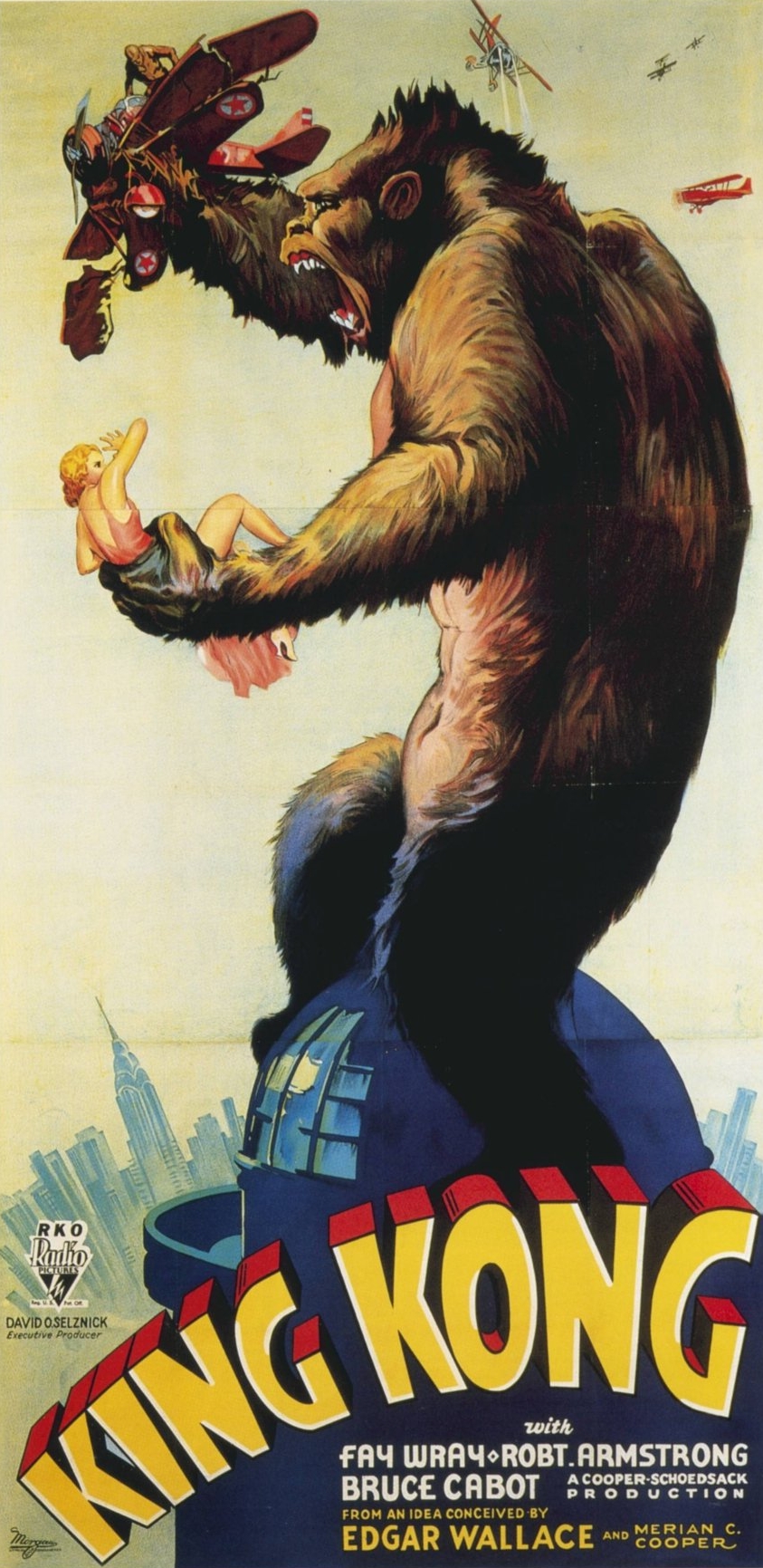
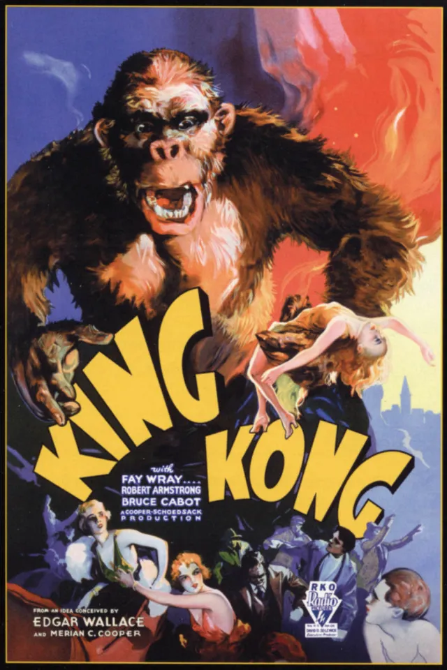
For our next stop, let's drop in on King Kong. We have a pair of posters for the original 1933 movie, the first of which depicts Kong's defiant last stand atop the Empire State Building, one of the most striking and iconic pop culture images of the 20th century. Kong clutches Ann Darrow in one paw while crushing a biplane in the other, as the remaining squadron of biplanes fires upon him. The dizzying heights of the New York City skyline are on full display, including the Chrysler Building. Unhindered by the technical limitations of the film, the poster adds a splash of colour to the scene as well as a greater sense of fluidity and depth to Kong than those afforded by his stop-motion figurine.
The second poster depicts the chaotic aftermath of Kong breaking free from his shackles, as evidenced by the horrified humans in formal evening dress fleeing for their lives as Kong roars at them in understandable anger. Once again, he clutches Ann Darrow in one of his massive paws. This time around, Kong bears a stronger resemblance to that of his stop-motion figurine, though more realistically detailed. Unlike the first poster, only a sliver of the New York City skyline can be seen peeking out from a corner, as the second poster places a larger emphasis on rising flames and billowing smoke.
My pick: When it comes to depictions of King Kong, the Empire State Building is top banana!
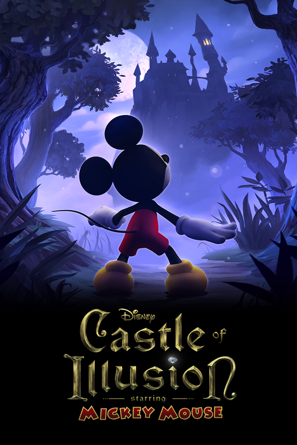
Castle of Illusion Starring Mickey Mouse, 1990 vs. 2013 Covers
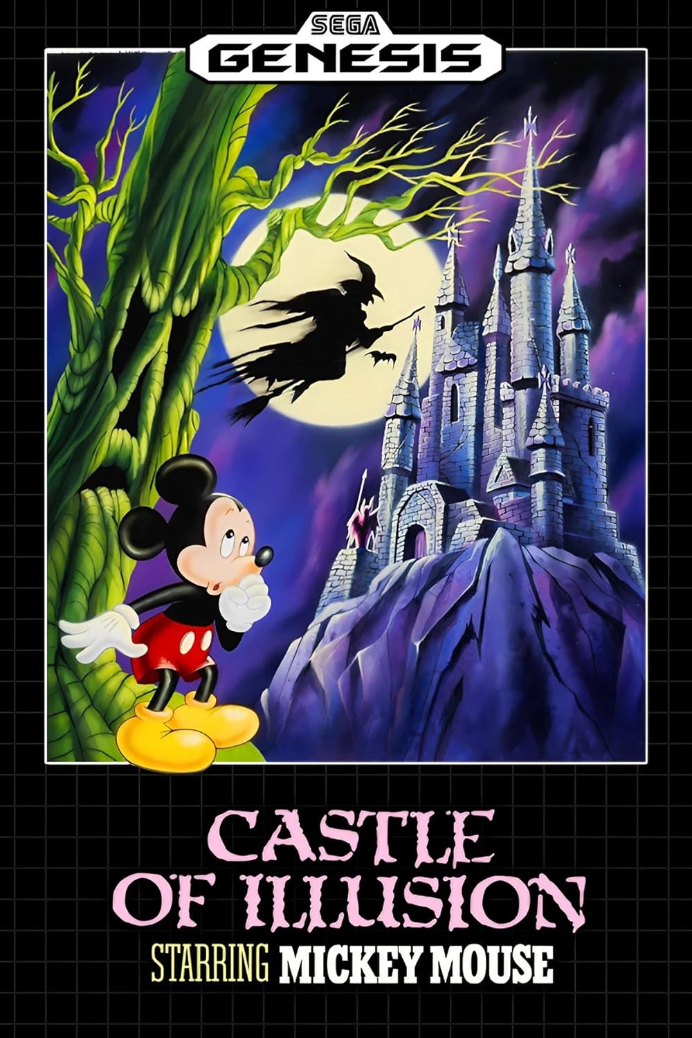
Moving right along, we arrive at Castle of Illusion Starring Mickey Mouse, a Sega Genesis classic that received an equally excellent PlayStation 3/Xbox 360 remake. The original 1990 cover screams Halloween with its spine-tingling imagery of an evil tree glaring down at a clearly unnerved Mickey, the moonlit silhouettes of a witch and her pet bat in flight, a distant demon brandishing a spear, and the imposing form of a spooky, haunted castle straight out of a gothic ghost story. You can tell poor Mickey is really out of his element in this macabre environment. If the 1990 cover were a Shakespeare play, it would be Macbeth.
The cover of the 2013 remake opts for a more whimsical design, trading in the haunted wasteland motif for a fairy tale garden aesthetic. As such, evil trees, witches, bats, demons, and gothic castles are out, while ordinary trees, glowing fireflies, and fairy tale castles are in. Even the full moon has been stripped of its eeriness. While Mickey's face isn't visible this time around, I imagine his expression is one of total relief to find himself back in his natural habitat. If the 2013 cover were a Shakespeare play, it would be A Midsummer Night's Dream.
My pick: I'm feeling more in the mood for Macbeth right now, so I'm going with the Sega Genesis original!
Fun fact: There's also a third unique version of Castle of Illusion Starring Mickey Mouse for the Sega Master System/Game Gear, which spawned its own line of direct sequels back in the day.
Live and Let Die, 1973 Poster vs. 1995 Cover
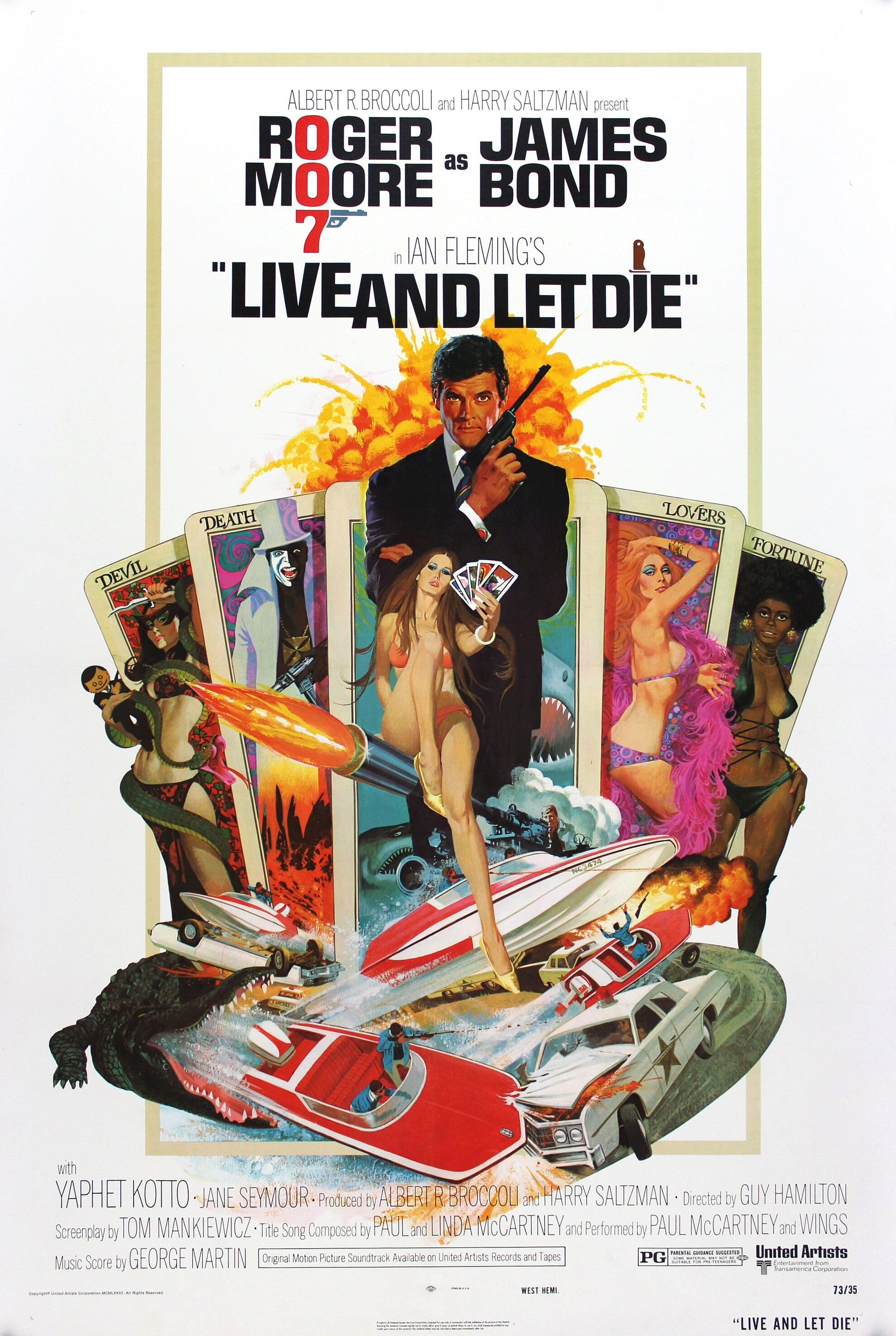
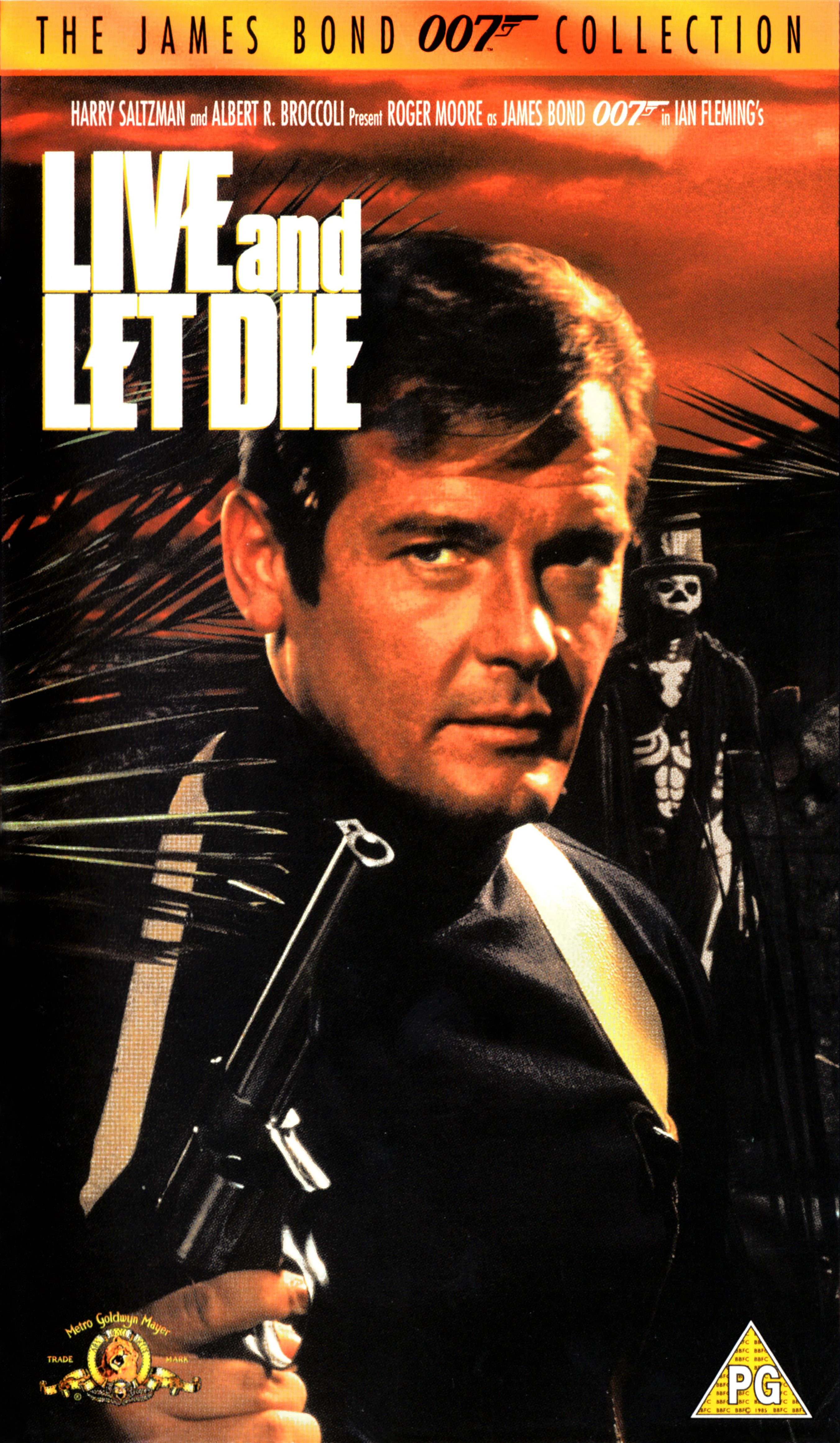
Now, we're standing in front of Live and Let Die, a James Bond classic starring Roger Moore. In this flick, Bond comes face to face with the supernatural, and Robert McGinnis' original 1973 poster reflects this with its focus on a tarot spread featuring characters representing the "devil", "death", "lovers", and "fortune" cards. While I recognize Bond (obviously!), Solitaire, Baron Samedi, and Rosie Carver from these cards, I've never been able to ascertain the identities of the red-haired woman with the pink boa draped around her neck or the brown-haired woman with a snake coiled around her torso (a relative of Britney Spears, perhaps?). The snake woman is also ominously clutching a voodoo doll of Bond in one hand while brandishing a dagger in the other, further fuelling the mystery. Aside from the tarot card theme are depictions of the car and boat chases as well as the crocodile and shark traps from the film.
In stark contrast, the 1995 VHS cover is far more bare-bones with its artistic approach, simply depicting Bond and Baron Samedi in a tropical jungle at sunset. While the mere presence of Baron Samedi on the cover is enough to represent the film's supernatural elements, the overall design remains rather minimalistic.
My pick: When it comes to James Bond posters, nobody does it better than Robert McGinnis!
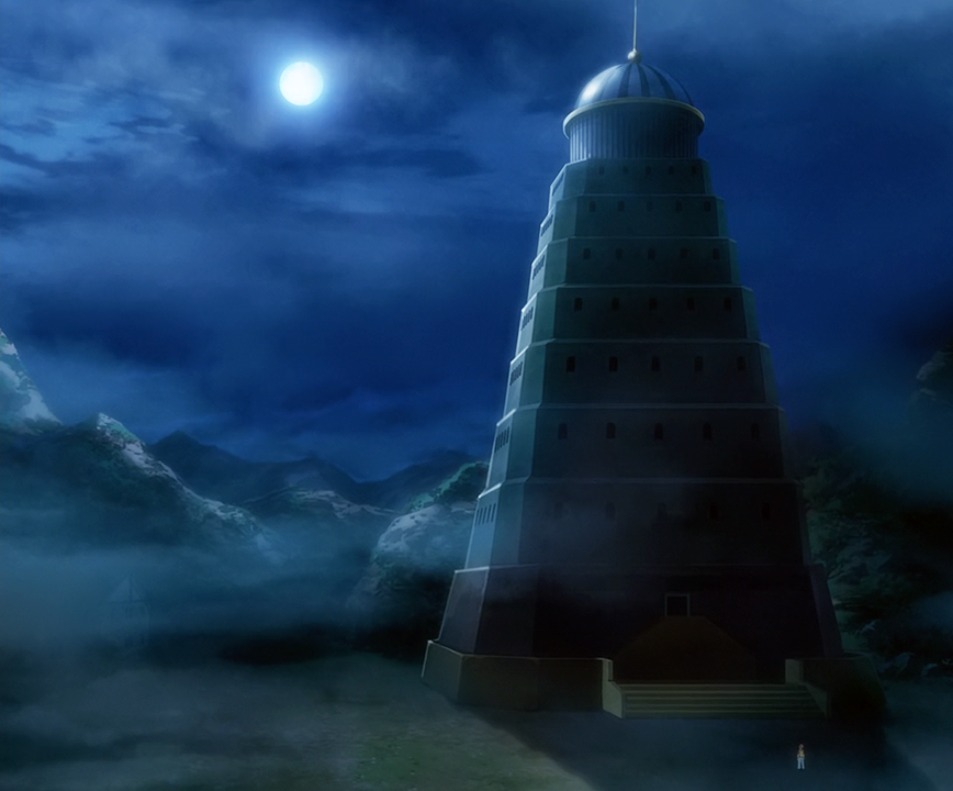
Pokémon Tower, 1997 Series vs. 2013 Miniseries
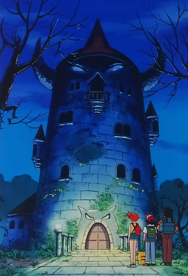
Let's wrap up our ghost walk at the base of the Pokémon Tower, a spooky landmark from the Pokémon franchise. While the Pokémon Tower was originally depicted as a mausoleum for deceased Pokémon (they don't just "faint"?!) in the 1996 Game Boy games, it was reimagined as an old, abandoned, haunted house in the The Tower of Terror episode of the 1997 Pokémon anime series. Architecturally-speaking, this cylindrical structure resembles a cross between a lighthouse and a medieval European tower, à la the one from the Rapunzel fairy tale. The conical roof has a pair of horns protruding from its sides, while the façade has an evil face carved into its masonry. This version of the Pokémon Tower is an imposing sight to behold, though one more likely to be encountered at an amusement park than within a city.
The 2013 anime miniseries, Pokémon Origins, serves as a more faithful adaptation of the original Game Boy games, and as such, the episode, File 2: Cubone reverts it back to its original role as a mausoleum for deceased Pokémon. In terms of architecture, the structure now matches its appearance from the video games as well. Its design appears to be modelled after a traditional Asian pagoda and is topped with a pendentive dome reminiscent of the one atop the Hagia Sophia in Istanbul. Like its 1997 counterpart, the 2013 Pokémon Tower is an equally imposing structure, though one more grounded in reality, architecturally-speaking.
My pick: A haunted house vs. a haunted mausoleum?! That's a toughie! Which do you prefer?
And that concludes our pop cultural Halloween ghost walk! Whatever your plans are this Halloween, have fun, be safe, and don't give yourself a bellyache from eating too much candy! Do you have any thoughts on this post? If so, feel free to reach out by leaving a comment, dropping me a line, or signing my guestbook to share your opinions on this or any other topic. To receive the latest updates on my work or to directly interact with my content ("likes" or comments), follow me on Neocities. Also, feel free to press the "like" button if you enjoyed this post, as "likes" help me gauge audience interest in the content I post. After all, I don't want to bore anyone, ha-ha. Until next time, love, peace, and chicken grease!
Posted in "Random Encounters" on Wednesday, October 29, 2025.