Cover Art Comparisons Fo(u)rever
"I honestly believe that advertising is the most fun you can have with your clothes on." - Jerry Della Femina
It's been a while, but we're finally back with a new batch of covers to compare, now 100% clickable for a better look at all the details. But enough talk...have at you!
Kingdom Hearts
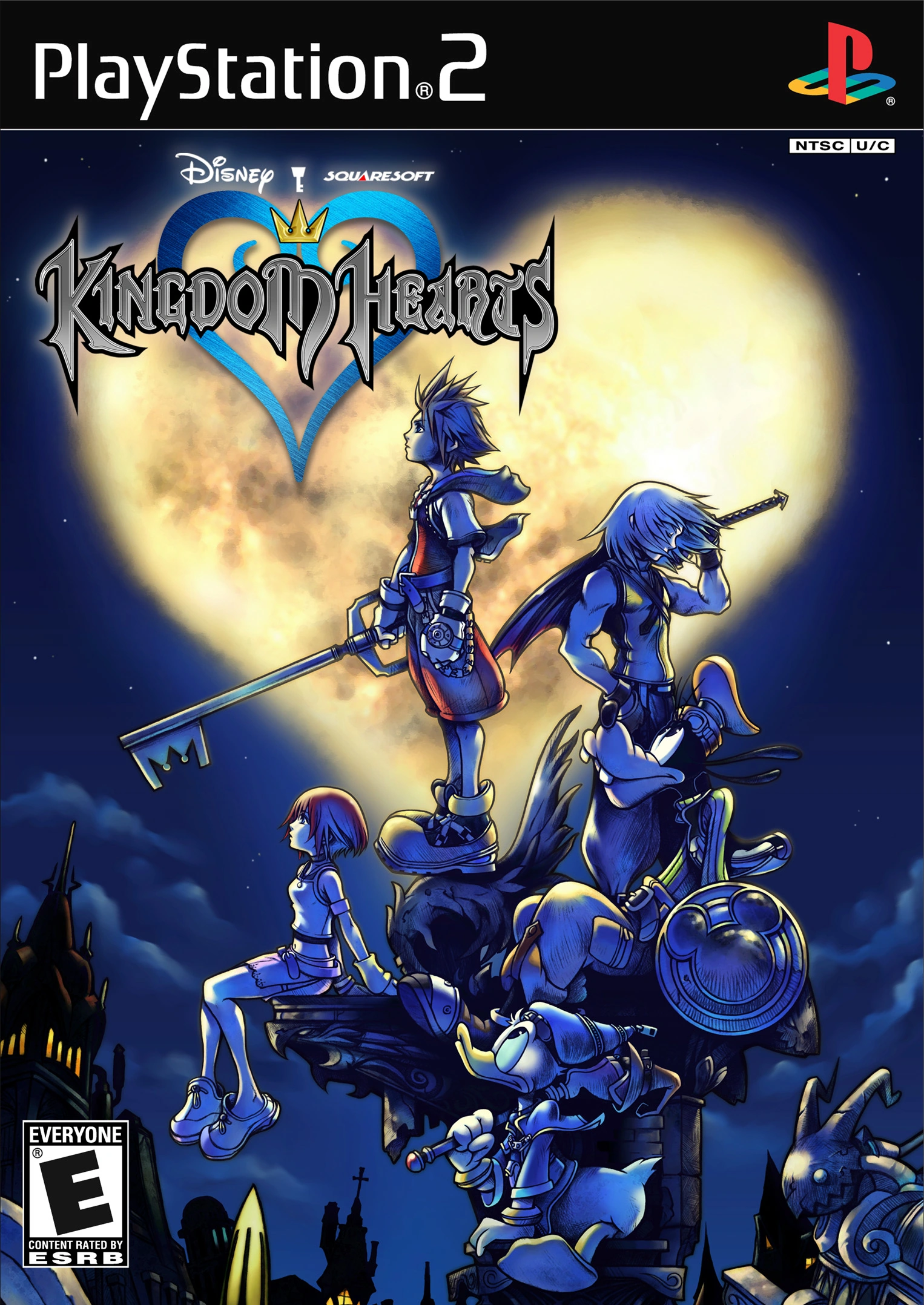

Let's kick things off by comparing the cover of 2002's Kingdom Hearts for the PS2, against that of its 2013 remake, Kingdom Hearts HD 1.5 Remix for the PS3. The original cover features the five principal characters hanging out together on the rooftops of Traverse Town, in front of a heart-shaped full moon. Sora, Kairi, Donald, and Goofy are all facing left while gazing up at the starry night sky, seemingly contemplating the mysteries of life. Riku, on the other hand, prefers to march to the beat of his own drummer, and so has chosen to face right, brooding in solitude. The characters are all bathed in moonlight and nightly shadows, casting a cool blueish tint upon each of their bodies. The overall imagery of Sora and company keeping vigil over the rooftops of Traverse Town reminds me of the poignant closing shot of Tim Burton's 1989 Batman flick (Danny Elfman's triumphant score during that scene still gives me goosebumps). I love everything about this cover.
The remake cover features Kairi, Donald, and Goofy standing on a checkered floor next to "King" Sora, who is seated regally on "his" throne with a look of amusement on his face. Of note, the appearance of the throne on this cover seems to be a parody of the Iron Throne from Game of Thrones, due to all the Keyblades jutting out of it. The "King"'s three loyal subjects are all smiling broadly, while Kairi appears to be testing the sharpness of one of the crown's palisades with her fingertip (ouch!). Above the quartet are Axel, Roxas, Xion, King Mickey, Riku, and Naminé, who are all smiling while the sky behind them transitions from sunset into dusk. I also love everything about this cover, though the nightly original speaks to me the most, so I must declare it the winner!
Jaws
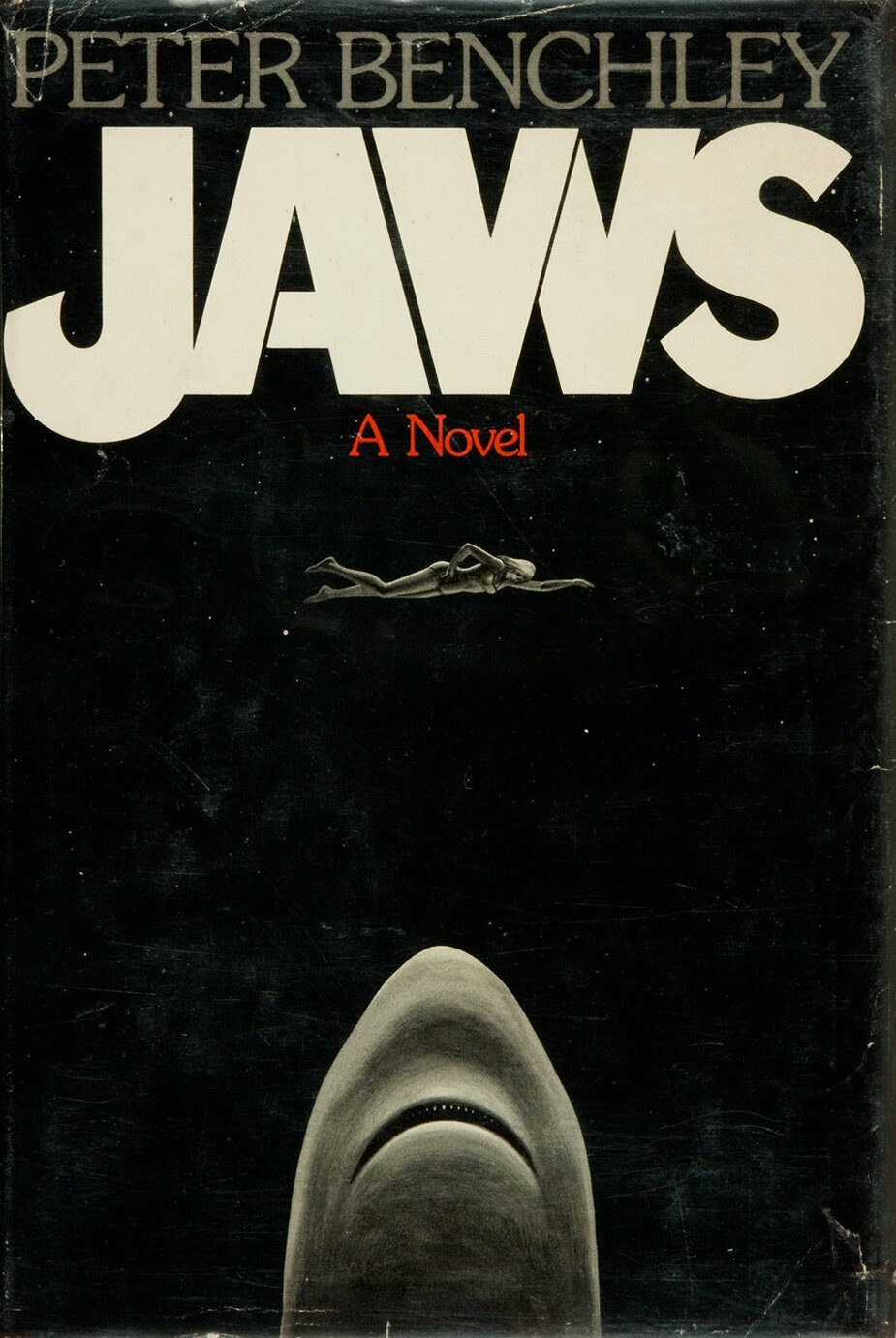

Summer may be over, but that doesn't mean it's safe to go back in the water! No, I'm afraid summer vacation never ends for the titular great white shark in Peter Benchley's 1974 novel, Jaws. Both the first edition and movie tie-in covers feature the same basic imagery: Chrissie enjoying a leisurely swim at sea, completely oblivious to the monstrous Jaws rising up from the fathoms for a quick bite to eat. Where these covers differ, however, is in the execution of their presentation. The first edition opts to depict this unnerving scene entirely within a black void, perhaps implying that Chrissie is swimming at night. Chrissie and Jaws are illustrated in greyscale. Chrissie is wearing a one-piece bathing suit. Jaws lacks any distinct features, save for his mouth and teeth, giving him a creepy, worm-like appearance. It isn't clear whether the mysterious creature lurking below the surface is a shark. This certainly is an unsettling work of art, which is appropriate, given the novel's subject matter.
The tie-in cover uses Roger Kastel's movie poster from Steven Spielberg's 1975 Hollywood adaptation (Robert Shaw's stellar performance as Quint is the highlight of that movie for me, though I digress). This cover is fully coloured and ditches the black void for a visual depiction of the sea, both above and below the water's surface. Chrissie is now swimming in her birthday suit (oh, my!). Jaws is finally seen in all his glory, with soulless black doll eyes, nostrils (why does a fish need nostrils?!?), and rows of razor-sharp teeth in his massive mouth. The air bubbles on either side of Jaws add a sense of motion to the image. A truly terrifying and haunting illustration. Interestingly, the first edition cover and movie poster share the same logo, while the tie-in cover based on this poster sports a different one. In my opinion, both covers do a good job evoking a sense of dread and unease. One depicts a mysterious threat while the other offers a detailed look at the menace rising from the deep. It's up to you to decide the winner!
Ecco the Dolphin
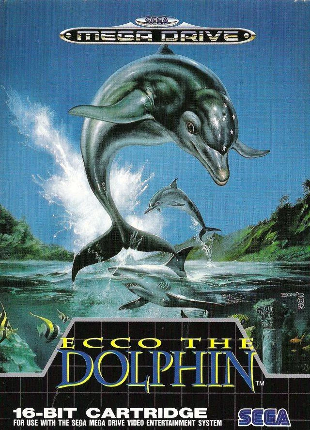
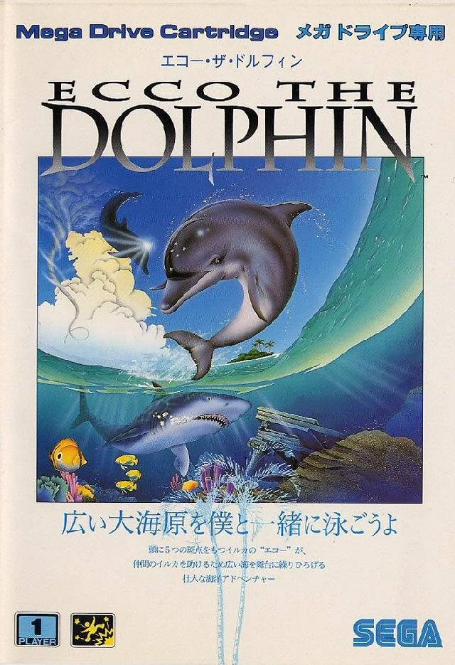
Sticking with the nautical theme, we have the North American and Japanese covers of 1992's Ecco the Dolphin for the Sega Genesis. As with our previous comparison, these two covers share many of the same elements: our titular cetacean hero and one of his fellow bottlenose dolphins leaping out of the water, a menacing great white shark lurking below the surface, along with schools of fish and some Ancient Greek ruins, suggesting the presence of Atlantis. Where these covers differ is mostly through their visual styles. The North American cover, set within a cove, was illustrated by Boris Vallejo, renowned for his medieval high fantasy art of chiseled, scantily clad men and women. The quality of his posters and covers are always top-notch, and Ecco is no exception. Everything on this cover exudes a sense of realism and depth, from the watery ripples, waves, and splashes, to the light, shadow, and sheen on Ecco's wet skin. These flourishes give the cover a cool pseudo-3D effect, as if Ecco is leaping out of the illustration.
The Japanese cover, set in open water, near a tropical island, is presented via a cool fisheye lens effect. The art is both brighter and lighter in tone than the gritty realism of Vallejo's art style. Exclusive to this cover are fluffy white clouds and a waterspout in the background, as well as an awesome sunlight effect on Ecco's now-somersaulting dolphin buddy. While there are light and shadow effects on this cover, they're less prominent than Vallejo's flourishes, and lack the pseudo-3D effect as a result. I usually prefer the more colourful, whimsical, and anime-inspired art styles of Japanese video game covers, to the darker and edgier North American variants. However, in the case of Ecco, I feel the bleaker artistic approach by Vallejo better suits the ominous tone of the game, especially given its dark plot and foreboding vibe. As such, the North American cover is the victor!
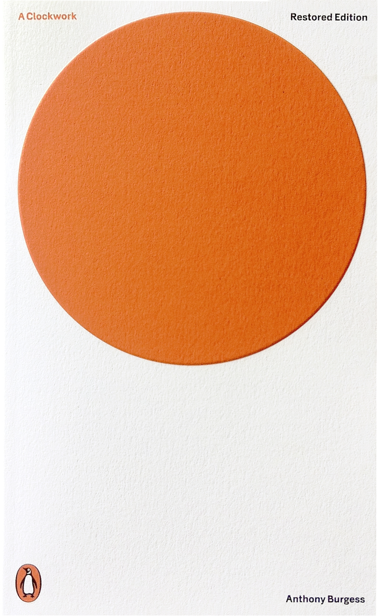
A Clockwork Orange
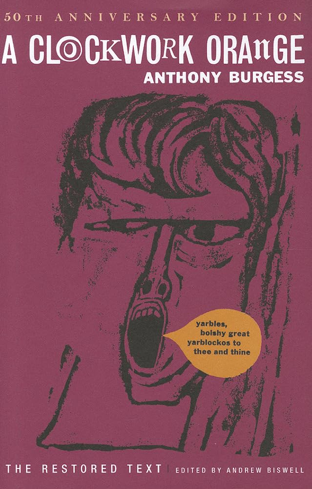
Next up is Anthony Burgess' 1962 novella, A Clockwork Orange, which has received many different covers over the years. For this exercise, we'll be pitting the 50th-anniversary reprint of the first edition's artwork against the cover of a more recent one. Unlike our prior two comparisons, this pair of covers share none of the same traits. Instead, they explore different aspects on the book's subject matter. The original cover features a sort of frantic freehand portrait of the story's teenaged "protagonist" (is that the right word for such a vile lead character?), Alex, who has a wild, angry, and deranged look about him (must be all the milk he drinks). Alex is also depicted shouting something in Nadsat (likely obscenities), the book's teenaged slang. It's a simple yet effective cover that gets its message across quite nicely.
The more recent cover takes a minimal art approach, visually depicting the novella's title as a large orange circle floating in a white void (a representation of the milk?), with the words, "A Clockwork" in the upper-left corner in orange. As somebody whose entire Neocities website is a work of minimal art (befitting of the old web, circa 1995), I get and respect what the illustrator is going for. It's a simple and effective design. Both covers are well executed. The first, depicts the emotional vibe of a violent mind. The second, represents a clever minimalist, design, which invites the reader to look closer. Again, I leave it to you to choose your favourite!
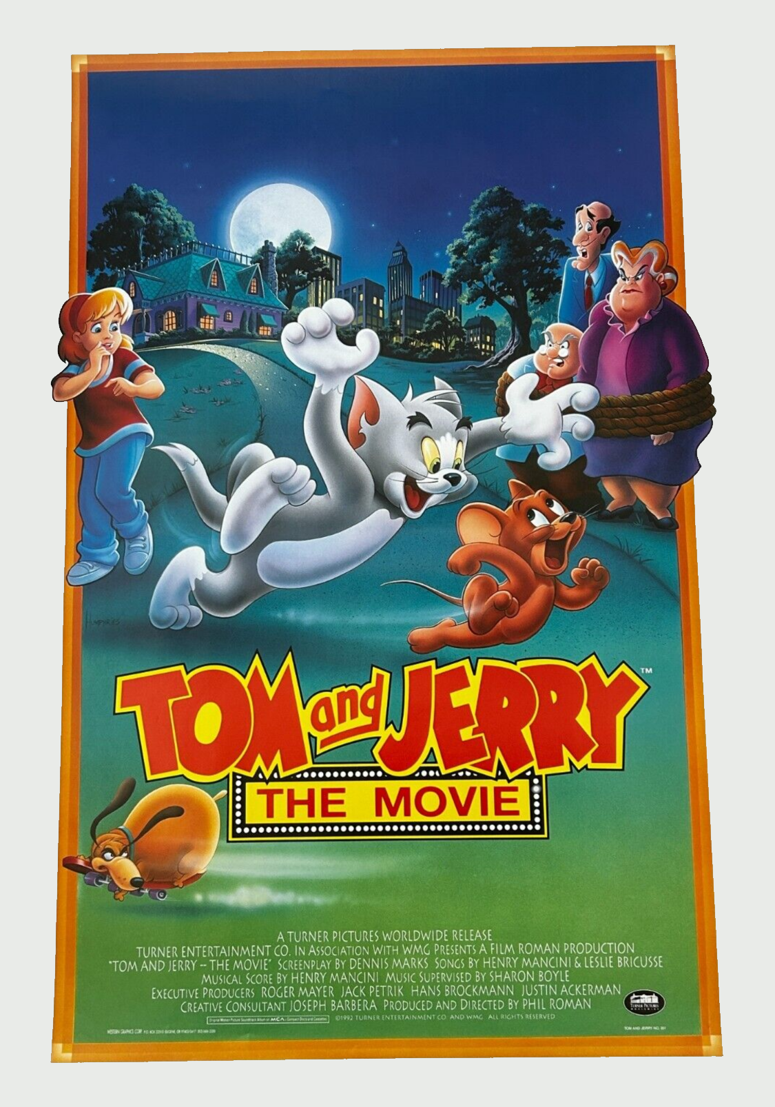
Tom and Jerry: The Movie
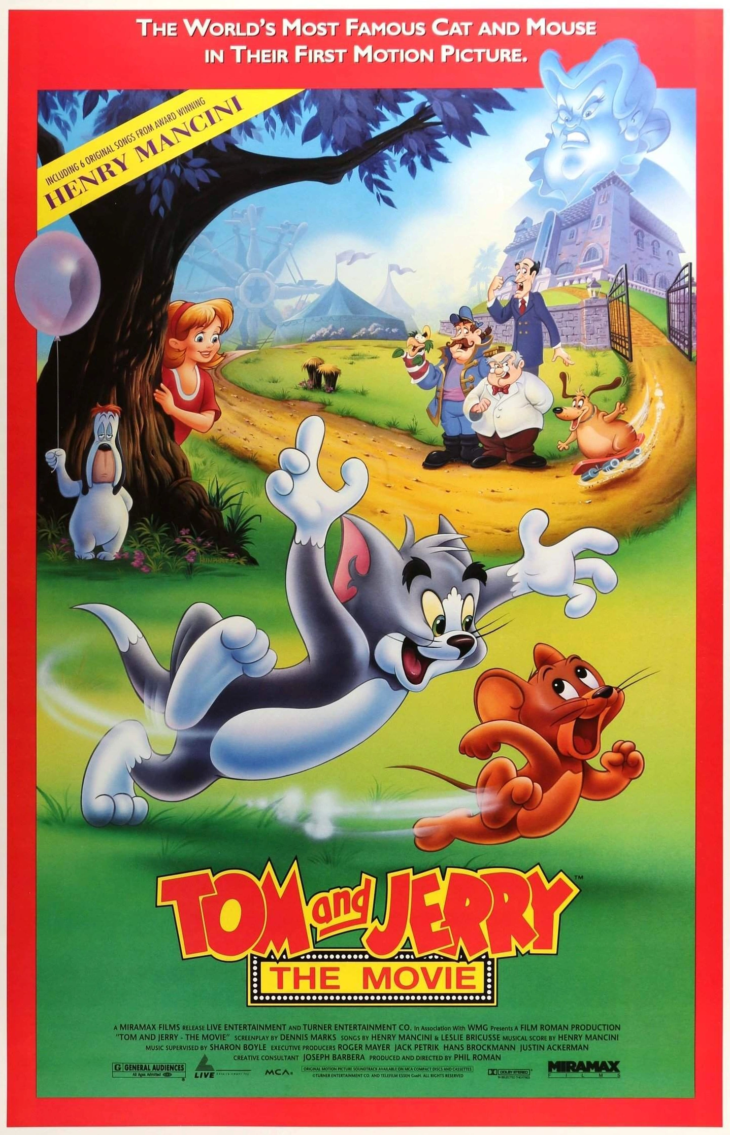
Let's wrap things up with a couple movie posters for 1992's Tom and Jerry: The Movie. Both versions share the same logo (I dig the cinema marquee lightbulbs around, "The Movie") and artwork of Tom playfully chasing Jerry, with both characters smiling, as if enjoying a fun game of tag. Trailing the duo are some cool "gusty" effects, giving a frenetic sense of motion to their chase. However, aside from these two identical details, each poster features their own unique settings and elements. The first is set during the day, at a field in the countryside, straddling an amusement park and what appears to be an imposing fortress. Behind Tom and Jerry, Droopy is holding a balloon, while Robyn is peeking out from behind a tree. Further back, Lickboot, Applecheek, and Captain Kiddie are angrily shaking their fists/parrot puppet at Tom and Jerry while simultaneously gazing at Ferdinand happily riding a skateboard (some dogs do ride them). A ghostly visage of Figg looms high in the sky above the fortress, large and in charge. Tom, Jerry, and the rest of the cast are all beautifully illustrated with plenty of light, shadow, and depth between them.
The second poster depicts a starry, moonlit night at a park in the big city (perhaps somewhere in the American Midwest?), with the cast gathered in front of a cozy-looking house on a hill. Behind Tom and Jerry, Robyn appears to be giggling at their silly shenanigans, while Figg, Lickboot, and Applecheek are tied up and not looking too pleased about it. Apparently, Droopy and the Captain are asleep in their beds, as both are absent this time around. The skateboarding Ferdinand is present, though less jovial than before, as he's now glaring angrily at the logo. The artistic flourishes on each of the characters remain just as impressive as they were in the previous poster, though now reflective of the nightly setting. Additionally, Robyn has extra white stripes on the sleeves of her T-shirt. I'm genuinely surprised that neither poster makes reference to the fact that Tom and Jerry actually talk in the movie (a big deal at the time of its release). Anyway, both posters evoke a sense of fun and are awesome works of art in their own right. However, I'm clearly a sucker for nightly imagery, as I find myself drawn more to the second poster, earning it the victory!
That's all for now...I'm definitely not Lester Holt. But thanks for joining us, anyway! Do you have any thoughts on this post? If so, feel free to reach out by leaving a comment, dropping me a line, or signing my guestbook to share your opinions on this or any other topic. Also, feel free to press the "like" button if you enjoyed this post, as "likes" help me gauge audience interest in the content I post. After all, I don't want to bore anyone, ha-ha. Until next time, love, peace, and chicken grease!
Posted in "Random Encounters" on Saturday, September 28, 2024.