Even More Cover Art Comparisons
"Many a small thing has been made large by the right kind of advertising." - Mark Twain
Mmmm! Smell that? We've got a new batch of covers, fresh out of the oven! Let's compare 'em while they're hot! Bon appétit!
Scott Pilgrim vs. the World
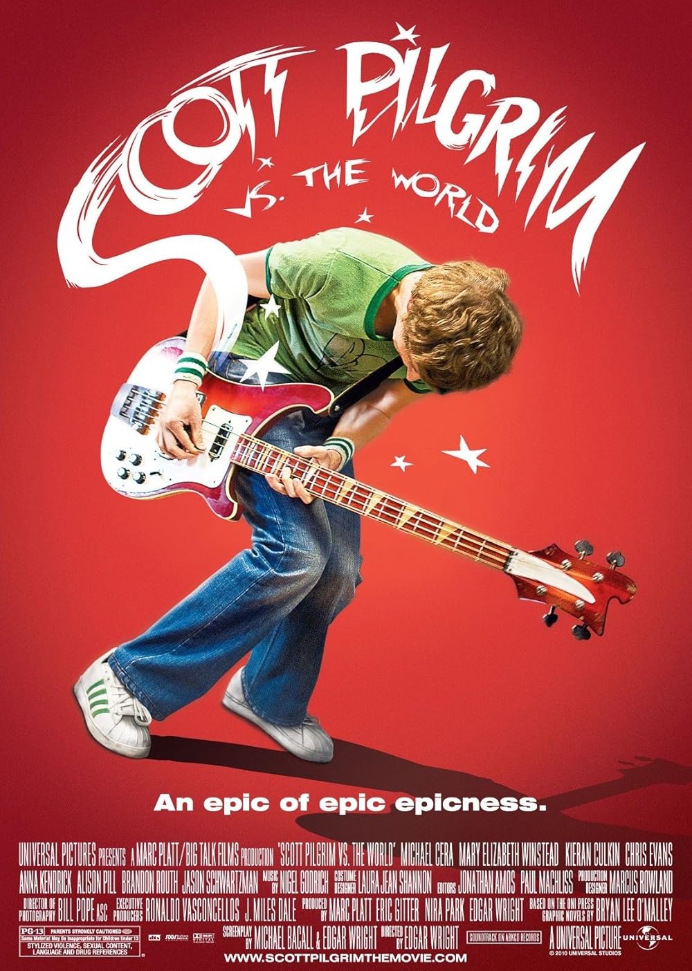
Let's kick things off with a look at two very different movie posters for 2010's Scott Pilgrim vs. the World, the first of which features the titular Scott Pilgrim rocking out on his bass guitar within a red void. Despite being a static image, you can really feel Scott feeling the rhythm while getting lost in the music. I love the comic book effects of the little cartoon stars hovering around Scott and the logo emanating from his guitar, like steam rising from a pie fresh out of the oven. The poster has a great use of colour, light, and shadow. The logo has a cool, hand-written quality, while the tagline has a nice ring to it, "An epic of epic epicness." Nothing on this poster belies the film's plot, other than it starring a guitarist and promising to be "epic". This enigmatic design choice gives both the poster and the film an intriguing air of mystery.
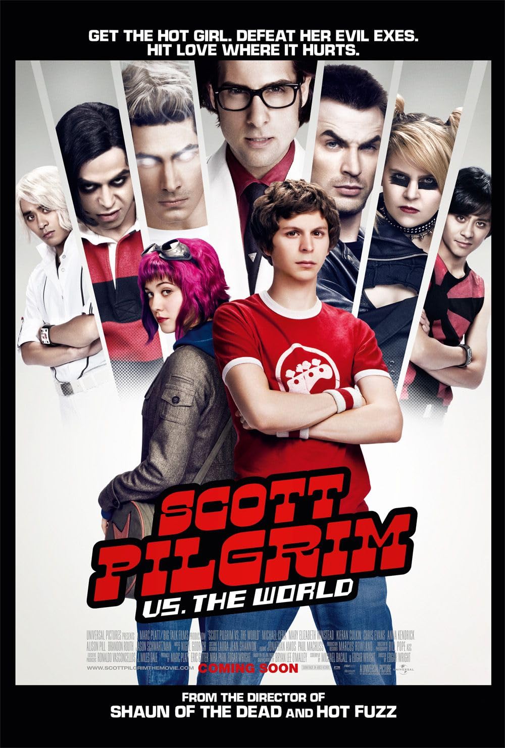
The second poster depicts Ramona and Scott standing back-to-back in a white void while Gideon and his League of Evil Exes loom menacingly over the couple. Scott and the Katayanagi Twins are striking matching poses with their arms folded in a no-nonsense sort of way. Everyone on this poster looks pissed and ready to fight. The logo has more of a traditional, corporate aesthetic about it, while the tagline sums up the movie's premise, "Get the hot girl. Defeat her evil exes. Hit love where it hurts." Personally, I prefer the more mysterious vibe of the previous poster, as it has a certain je ne sais quoi quality to it. Simplistic yet effective in its execution. For these reasons, the first poster wins this round!
Fun fact: I was visiting New York City when Scott Pilgrim vs. the World premiered in cinemas and remember seeing our winning poster plastered all over the Big Apple: subway stations, taxi cabs, shopping malls, you name it. Being from Toronto, I was used to seeing such Hollywood marketing, for films set in New York City, across Toronto. As such, it was equal parts cool, surreal, and refreshing to see a film, set in Toronto, advertised across New York City. Too bad Scott Pilgrim vs. the World flopped at the box office, but I'm glad I was among the moviegoers who supported this unique movie, before it achieved cult success on DVD and streaming platforms.
Who Framed Roger Rabbit
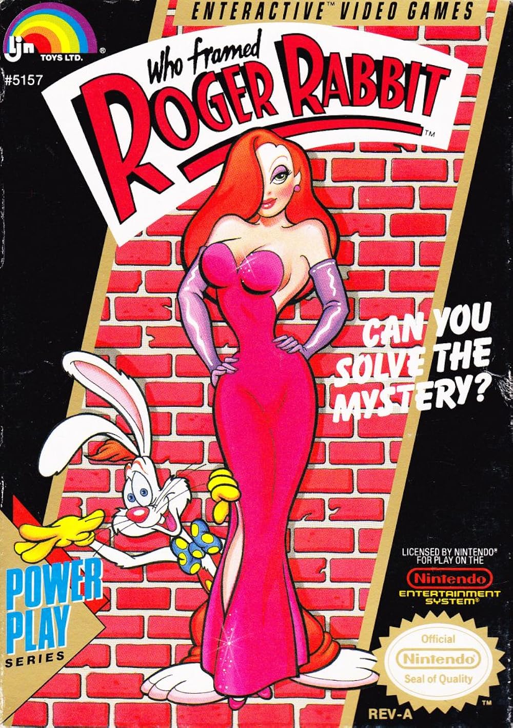
Here, we have two different covers for two different video game adaptations of Who Framed Roger Rabbit, developed for two different Nintendo platforms by two different teams, both of which were released two years apart. First up is Rare's 1989 NES adaptation. This cover features Roger smiling and waving as he peeks out from behind his wife, Jessica, who's striking an elegant pose with her hands on her hips. The couple are standing in front of a red brick wall, though they appear to be hovering in the air, given the lack of an illustrated surface. Both characters are nicely illustrated and match their appearance from the 1988 film. The sparkles on Jessica's dress and sheen to her gloves are also cool touches.
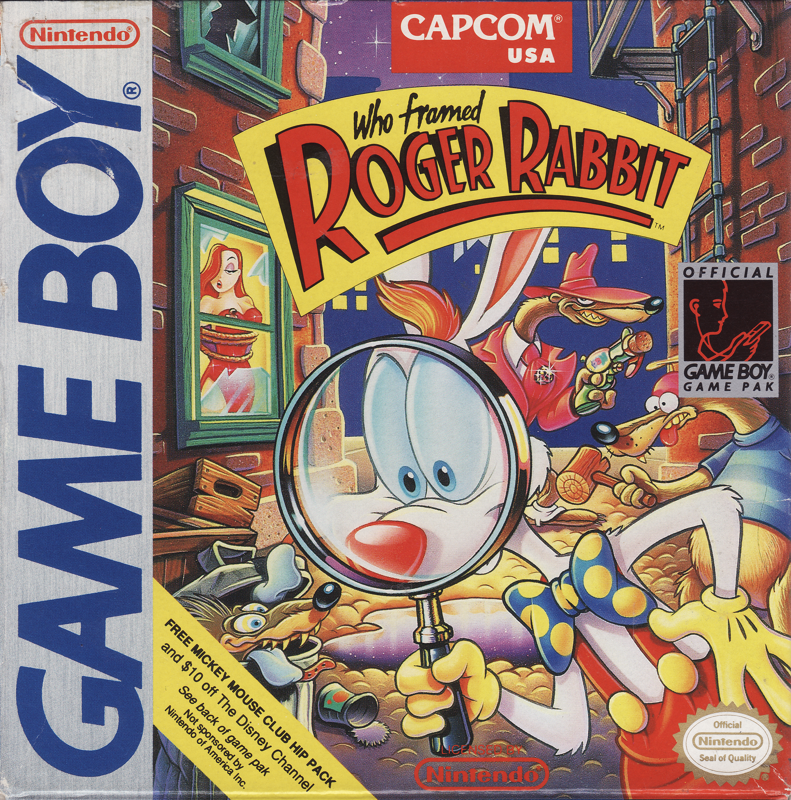
Next up is Capcom's 1991 Game Boy adaptation. This cover, illustrated by Greg Wray, features Roger investigating a seedy Toontown alleyway at night with a magnifying glass, completely oblivious to the fact that his beloved Jessica is being held captive in the building directly behind him, or that a trio of evil Weasels are about to do him in. The artwork is spot-on with the animated look of the film, and I love all the intricate details: the metal fire escape and red brick buildings, the shiny puddle in the cobblestone streets, the twinkling stars above the rooftops, Jessica's presence in the window, the Weasels ready to ambush Roger in the alley...it's all beautifully illustrated, and simultaneously conveys a sense of dread and humour for our long-eared detective. No mystery to solve here, the Game Boy cover is clearly the victor!
Hollywood Sign
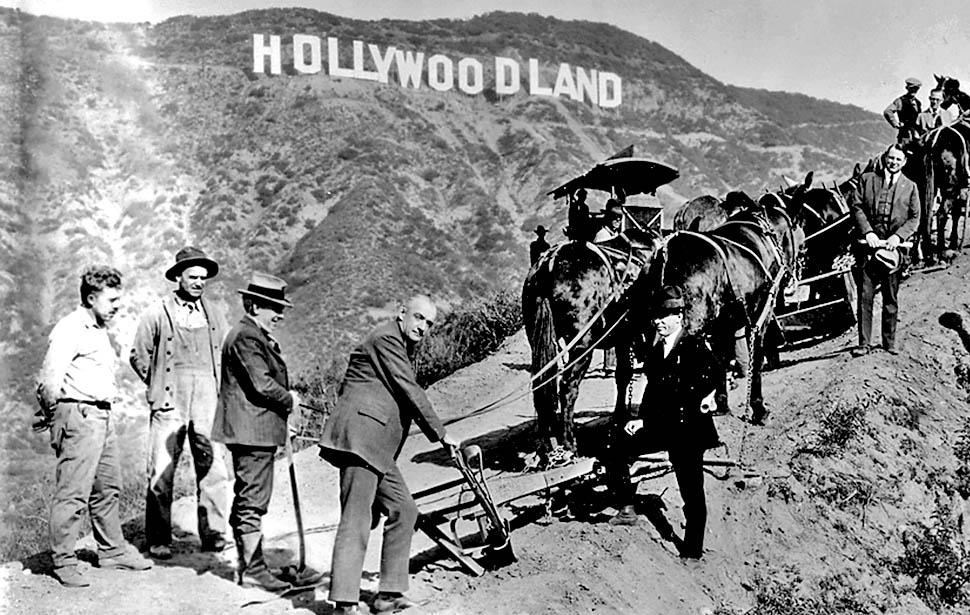

As with McDonald's, the Hollywood Sign is another prime example of pop culture Americana that I feel also deserves a place on this list. The original, wooden Hollywoodland Sign was erected in 1923 as a "temporary" advertisement for a nearby housing development of the same name. It consisted of thirteen gigantic letters adorned with thousands of lightbulbs that illuminated the sign for a bright, nightly light show, first flashing out "HOLLY", then "WOOD", and lastly "LAND". Those lights must've been quite a cool sight! Back then, one could also hike right up to the sign and touch it. Sadly, the sign was stripped of its nightly illumination and "LAND" portion in 1949. Over the subsequent three decades, the remaining nine letters gradually rotted and deteriorated beyond repair...
...Which brings us to 1978, when the wooden remains of the original sign were finally replaced, thanks to wealthy donors, with the current, steel Hollywood Sign, which is what the modern world now associates with the glitz and glamour of Hollywood. As has been the case since 1949, the modern version consists of nine letters and no lightbulbs, which also means no bright, nightly light show. It also cannot be directly hiked to nor touched, given the high-tech security surrounding it. For these reasons, I must give the original Hollywoodland Sign the victory. After all, Tinseltown is all about razzle dazzle, and the wooden Hollywoodland Sign was literally bigger, flashier, and more approachable than its steel successor. You can't get more razzle dazzle than that!
Star Wars: Special Edition
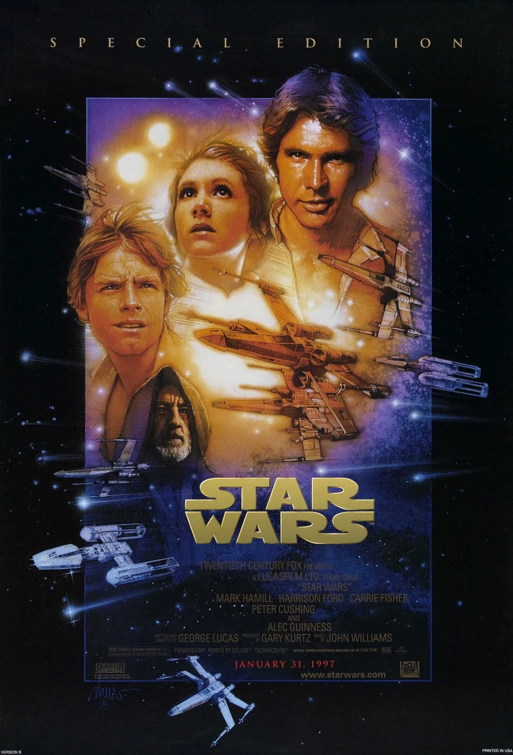
Since we're already on the topic of Hollywoodland, let's cover the covers of 1997's much-maligned Star Wars: Special Edition next. While this version of the iconic 1977 space opera is controversial for all the changes George Lucas made, and continues to make, to it (most recently, with Greedo blurting out, "maclunkey!"), there's nothing to criticize about the updated theatrical poster by Drew Struzan. Here, we have a beautiful collage comprised of the four protagonists, Luke Skywalker, Princess Leia, Han Solo, and Ben Kenobi, as well as a few Rebel starships engaging in the climactic Battle of Yavin, while the twin suns of Tatooine glow brightly in the background.
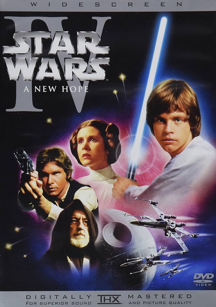
The DVD cover tries to replicate the poster's vibe with similar imagery based around the same elements. However, the live action film stills of the cast, while sharp and of high quality, just aren't as visually striking or impactful as Struzan's hand-illustrated work of art. If given the choice between a photo or a painting to represent a movie, I always prefer the latter, more laborious and intricate method. So, as with the theatrical poster of An American Tail, I must give Drew Struzan the win, yet again!
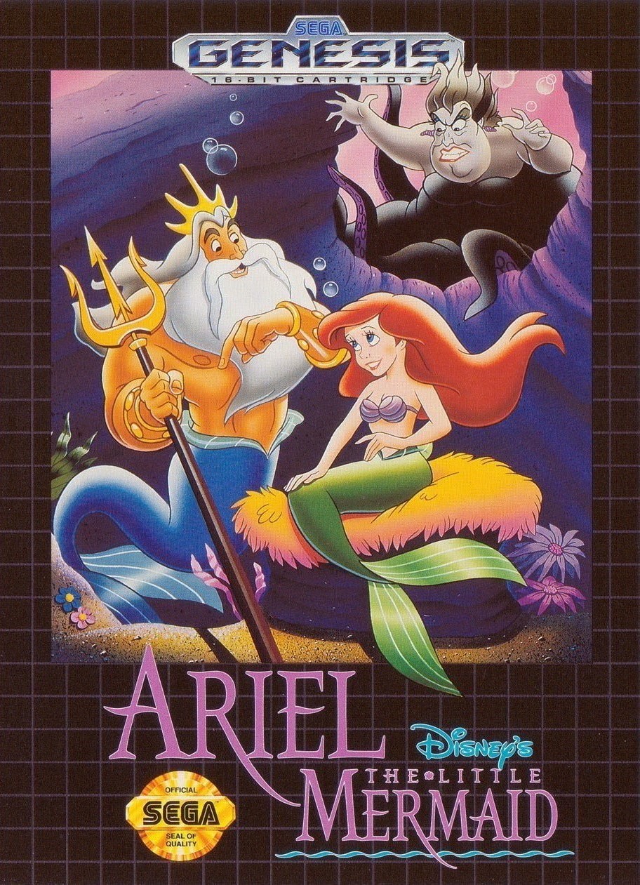
The Little Mermaid
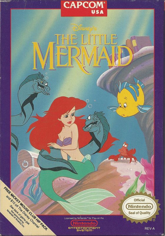
Since we began our previous batch of covers with 1989's The Little Mermaid, let's end this one with the film's two video game adaptations. We're pitting Nintendo against Sega in a reenactment of the Console Wars! Capcom's 1991 NES cover is based around the scene from the movie where the eels creepily invade Ariel's personal space while attempting to entice her to see Ursula. We have Ariel looking understandably uncomfortable with that smirking eel rubbing up against her body, Flounder appearing worried for her, and Sebastian glaring angrily at said eel. It's an unsettling image to be sure, and one that really makes you feel Ariel's discomfort. All the characters present are illustrated nicely, and I dig the background details of Ariel's treasure chest and books as well as the sunlight touching the seabed.
BlueSky Software's 1992 Genesis cover swaps out the "stranger danger" vibes for a familial scene of Ariel and Triton enjoying some father-daughter bonding time, blissfully unaware that Ursula is menacingly creeping up behind them, likely looking to transform the two merpeople into a pair of polyps. Ariel and Triton are drawn well, matching their looks from the film, though the proportions of Ursula's face seem somewhat off-model. The flourishes of light and shadows on Ariel, Triton, and Ursula's bodies adds a cool sense of depth that's lacking from the NES cover. It's interesting how Ariel is seated on rocks in a similar manner in both covers, though her body language and facial expressions are quite different, due to the situations she finds herself in. Both covers are fine works of art, though I must declare the Genesis version the winner, for the greater attention to detail in the execution of its artwork!
And with that, the bakery is sold out of covers for today but will cook up another batch soon! Do you have any thoughts on this post? If so, feel free to reach out by leaving a comment, dropping me a line, or signing my guestbook to share your opinions on this or any other topic. Also, feel free to press the "like" button if you enjoyed this post, as "likes" help me gauge audience interest in the content I post. After all, I don't want to bore anyone, ha-ha. Until next time, love, peace, and chicken grease!
Posted in "Random Encounters" on Sunday, September 8, 2024.