Cover Art Comparisons Halloween Special, A.D. 2024
"Jeepers Creepers, where'd ya get those peepers? Jeepers Creepers, where'd ya get those eyes?" - Louis Armstrong
Welcome to Cover Art Comparisons' inaugural Halloween special! We've got five pairs of spooky covers to compare (well, four pairs of covers and one pair of theme park architecture, if we're being technical), so put on your best costume, grab yourself a bowl of candy, and let's get this supernatural show on the road!
Sleepy Hollow, 1999, the Headless Horseman vs. Ichabod Crane and Katrina Van Tassel
In my opinion, no work of horror better encapsulates the Halloween spirit than Washington Irving's 1820 ghost story, The Legend of Sleepy Hollow. The tale of a Hessian (German) mercenary, whose head was blown off by cannon fire during the American Revolution, and whose ghost now haunts the old cemetery where his body was laid to rest, galloping through the night on his thunderous war horse (a night mare?), seeking a new head to replace the fiery jack-o-lantern he wears as a temporary substitute. Chilling stuff that really stirs the imagination. As such, let's kick off our Halloween special with a pair of movie posters for 1999's Sleepy Hollow. The first is solely focused on bringing this iconic imagery of the Headless Horseman to after life, with the imposing Hessian mounted atop his rearing war horse on a foggy, moonlit night, with his battle axe raised and long cape blowing in the night wind. The shadowy ghosts of the Hessian and his war horse are silhouetted against the pale moonlight, while a spooky tree in the foreground looms menacingly over the ghostly duo with its twisted branches resembling outstretched hands. The whiteness of the full moon and redness of the film's logo juxtaposed with the blackness of the Headless Horseman, war horse, and spooky tree results in a strikingly cool effect. Great design overall.
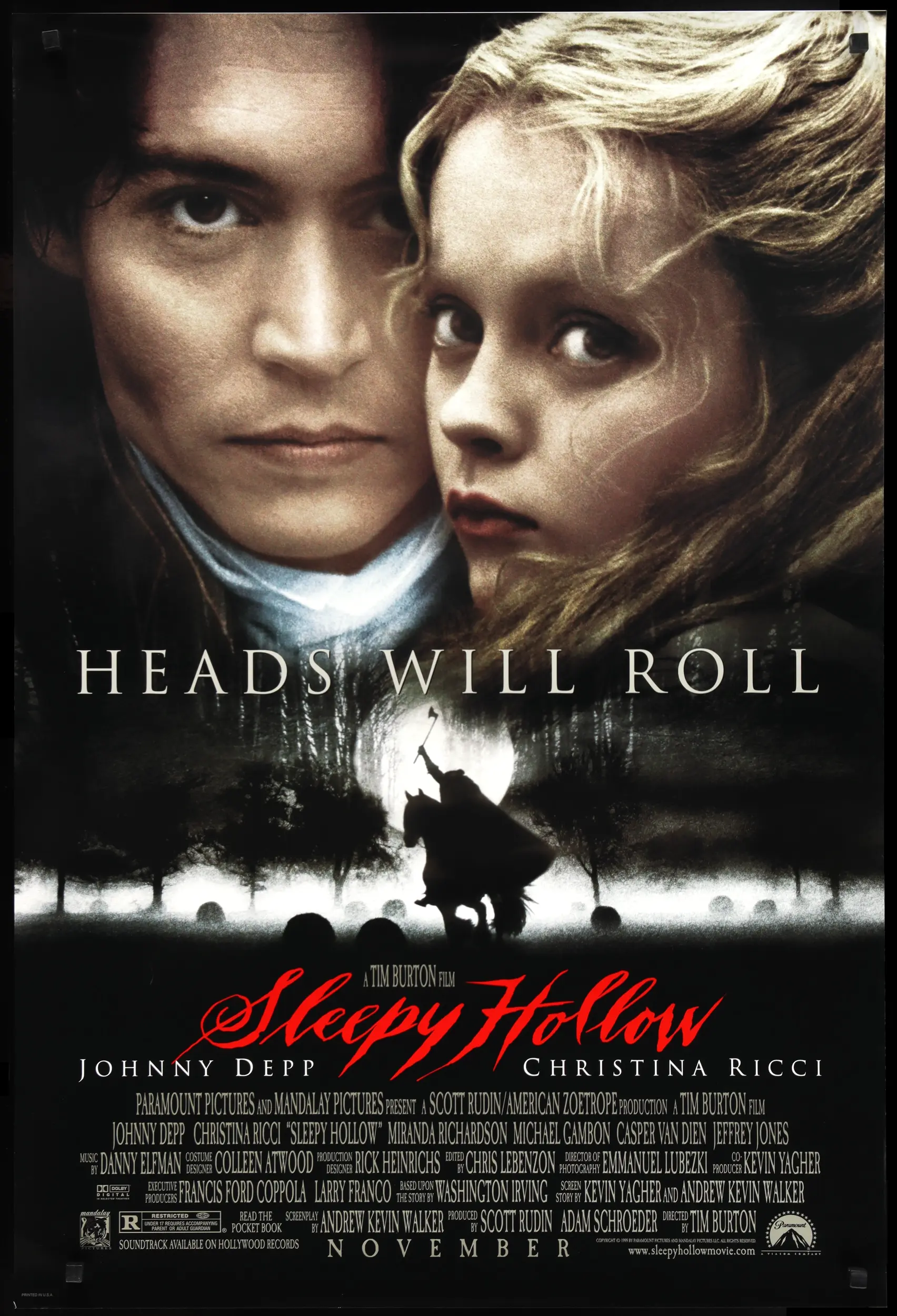
In contrast, the focal point of the second poster are the film's Hollywood stars, Johnny Depp and Christina Ricci, with a close-up of their characters, Ichabod Crane and Katrina Van Tassel, occupying the entire upper half of the poster. The expressions worn on the two protagonists' faces are quite solemn, no doubt on account of the severity of their situation: a headless ghost looking to severe both of their heads. The bottom half of the poster depicts the Headless Horseman riding his war horse through what looks to be either a cemetery or a pumpkin patch, on a foggy, moonlit night. The only elements shared between the two posters are the blood-red logo, which is brighter in this design, and the highly appropriate tagline, "Heads will roll." While both posters are cool, I honestly feel the first is more impactful for focusing its attention on the biggest draw of the film, the Headless Horseman. Relegating the Hessian's ghost to the bottom half of the poster diminishes his scariness. I get it, big Hollywood stars like Depp and Ricci fill cinema seats. Still, a ghost as iconic as the Headless Horseman should've been given more prominence on the poster than simply riding through a cemetery or a pumpkin patch. Ichabod and Katrina are both cool, but the Hessian's ghost is just a tiny bit cooler, in my opinion. So, the Headless Horseman is my pick for this category!
The Haunted Mansion, 1969 and 1971, Classical Revival vs. Gothic Revival
First opening its creaky doors to fearful mortals in 1969 at Disneyland in Anaheim, California, and then again in 1971 at Walt Disney World in Orlando, Florida, the Haunted Mansion is a definite E-ticket ride. From the stretching portraits to the hitchhiking ghosts, the Haunted Mansion is more fun than it is frightening, and a guaranteed good time for all souls brave enough to venture within its chilling walls. While I've ridden the Walt Disney World iteration many times during my two teenaged trips to the Florida park, I've never been to California, and therefore cannot directly compare ride experiences. As such, we'll simply focus on the architectural differences. Disneyland's Haunted Mansion was constructed in the Classical Revival style, evoking the visual aesthetic of Antebellum plantation manors, such as those depicted in Gone with the Wind. Such Southern mansions are already scary from a historical perspective, due to the horrors of slavery that are forever tethered to their cotton fields and stone foundations. Putting that ugliness aside, the Haunted Mansion also evokes a sense of New Orleans' Bourbon Street via the intricate ironwork of its exterior galleries. Ancient Greek columns are always a cool facade feature. I also dig the palm trees and other tropical flora around the mansion, as well as that cool carriage parked out front.
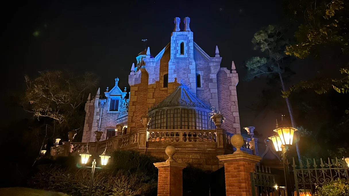
Opting for a different architectural approach, Walt Disney World's Haunted Mansion was built in the Gothic Revival style that was widespread throughout 19th century England, evoking the look and feel of medieval cathedrals and castles. I love the masonry of this design; the spires, curved windows, brickwork, solarium, wrought iron fence, etc. There's a spooky beauty to these stylings that certainly lend themselves well to the horror motif of the ride. Honestly, I feel both designs suit their respective themed areas of New Orleans Square and Liberty Square, so I'll let you choose the pick for this category! Before moving on, though, I'd like to mention that the Haunted Mansion is unique among haunted house attractions, as it can be enjoyed by autistic individuals with super sensitive hearing. Speaking from experience, I've often had to ride such carnival haunted house attractions with my index fingers inserted firmly into my ears on account of the loud cacophony of shrill noises commonly associated with such rides: all the clanging, banging, sirens wailing, bells ringing, whistles singing, etc. Thankfully, I never experienced such rackets in the Haunted Mansion during my two teenaged trips to Walt Disney World. It truly is refreshing for those of us with sensitive hearing to soak in the eerie ambience rather than focus our attention on shielding our ears from ear-piercing agony.
Fun fact: While the Haunted Mansion's Ghost Host is only briefly glimpsed above the room with the stretching portraits, you can see the otherwise anonymous phantom in all his ghoulish glory here. Pretty ghastly, huh?
Ghosts 'n Goblins, 1986, and Ghouls 'n Ghosts, 1991, Nintendo vs. Sega
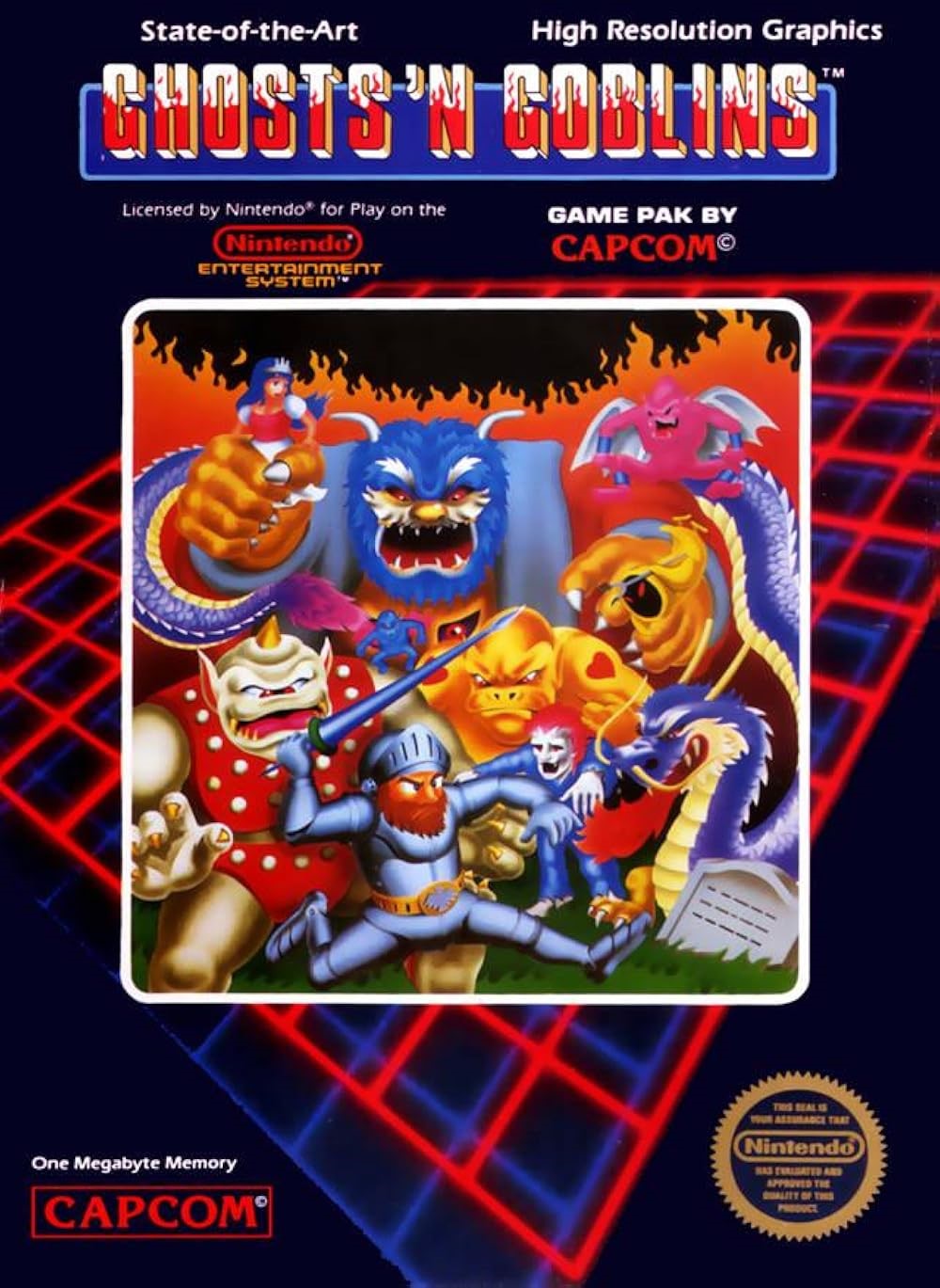
Fresh off my recent review of the Ghosts 'n Goblins Trilogy, we're pitting my least liked entry in the series, the 1986 Nintendo Entertainment System port of Ghosts 'n Goblins, against the 1991 Sega Master System port of Ghouls 'n Ghosts, which I never even knew existed until recently. However, as we're simply comparing covers rather than gameplay, Ghosts 'n Goblins actually has a chance of winning. Speaking of which, let's get the original out of the way with first. We've got a cool fiery logo as well as the 1985 arcade flyer's artwork juxtaposed over a hardcore 1980s neon grid pattern (cue the new wave music on a Sony Walkman). The artwork offers an extremely rare glimpse of Arthur with his clothes on, for at least another second or two, preparing to hurl a lance like a javelin. Judging from the lone tombstone and rising flames, it appears Arthur's in a cemetery set ablaze by spreading wildfire. Behind him stands a rogues' gallery of all the enemies I love to hate: the tiny flying imp, tattooed ogre, spry zombie, annoying fire breathing dragon, flying pig in a blanket, and God-awful flying red gargoyle. These fiends are joined by the big cyclops boss and the gargantuan final boss, who's clutching poor Prin Prin in his filthy paw. This cover does a stellar job at capturing the essence of what makes this game so damn frustrating.
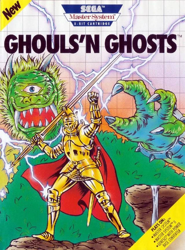
The Sega Master System cover of Ghouls 'n Ghosts is clearly modelled after the more impressive 1989 Sega Genesis cover, though lacking the 1989 artwork's impressive detail and artistry. The logo is quite simple, as is the white grid behind the artwork. The cover depicts Arthur decked out in his upgraded golden armour, clutching a lance while striking a dramatic pose, as he channels the energy of the lightning bolt coursing through his body into a charged and devastatingly powerful special attack. Might I add, Arthur looks quite stylish rocking that cape and visored helmet. Anyway, Arthur appears to be standing on the rocky edge of a cliff, opposite a tiny waterfall. Behind Arthur appears to be the treetops of a dense forest...or the furry body of the colossal cyclops boss hoping to snatch Arthur in its handsy death grip. Despite the cyclops' intimidating jaws that bite, claws that catch, and horns that...I dunno, pierce, there's more of teddy than of bear about this overgrown furball, and it wouldn't look out of place amongst all the other Sesame Street monsters. Of further note, this cyclops appears to be quite fashionable, having borrowed (or stolen) a pair of Bowser's spiked wristbands. While I imagine the SMS game is probably much better than the NES game from a gameplay perspective, in terms of cover art, I must admit that Ghosts 'n Goblins has the more detailed design. So, Nintendo is my pick for this category!
Garfield's Halloween Adventure and Garfield in Disguise, 1985, Flat Orange Crush vs. Fresh Orange Crush
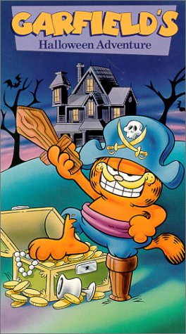
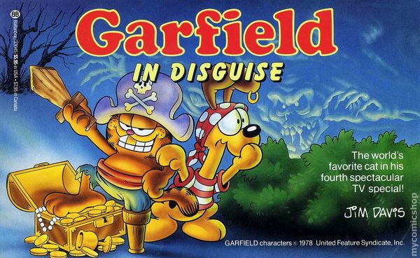
The 1985 TV special, Garfield's Halloween Adventure, received a VHS release as well as a graphic novelization, which will be the focus of our current category. Whether you choose to watch or read this seasonal Garfield special of the mid-1980s, you're in for a Halloween treat that begins innocently, with Garfield and Odie out trick-or-treating, before careening into supernatural territory, with ghost pirates seeking their long-lost treasure. Both mediums share the same artwork of Garfield on their respective covers, flashing a confident grin while raising his wooden sword triumphantly and resting his foot atop an opened treasure chest. Both covers depict Garfield in his pirate costume, consisting of a peg leg, trousers, waist sash, and captain's hat. Aside from the shared imagery of Garfield, each cover features their own unique elements, including different logos and titles. The VHS cover depicts Garfield standing alone in front of a haunted house at dusk. The haunted house sits atop a hill, straddled by a pair of trees, with a couple bats flying about, and the chalice resting at the foot of the treasure chest is silver. There are little flourishes of light, shadow, and depth, with a faint amount of each on Garfield's body. If this Garfield were a glass of Orange Crush served from a restaurant's soda fountain, he would be rather diluted and flat.
Thankfully, the paperback cover is far more lively, vibrant, and detailed, with Garfield now sporting a gold tooth as part of his pirate ensemble, as well as being bathed in an abundance of light, shadow, and depth effects across his entire body, further enhanced by the illuminated glow of the treasure reflecting off his belly. The chalice at the foot of the treasure chest has been upgraded from silver to gold. Absent are the haunted house, hillside, and bats, replaced with a layer of fog, single tree, and some bushes. However, the most notable alteration is the supernatural presence of a ghost pirate ominously materializing amongst the clouds of the night sky. Two heads are better than one, and Garfield is now accompanied by his first mate and co-star, Odie, who's decked out in his own pirate costume, consisting of a striped shirt and polka dot bandana with an earring dangling from his ear. Unlike Garfield's overly confident smile, Odie appears to be rather scared at the approaching ghost pirate, tapping Garfield on the shoulder to draw his pal's attention to the looming supernatural threat at hand. Awesome work all around. If this Garfield were a glass of Orange Crush served from a restaurant's soda fountain, he would be fresh and bubbly. So, fresh Orange Crush is my pick for this category!
Fun fact: The original title of the TV special was intended to be Garfield in Disguise, but it was later changed to Garfield's Halloween Adventure. This change is reflected in the first printing of the graphic novel, which bears the original title. Also, the graphic novel is slightly longer, containing additional scenes likely excised from the TV special. Pretty cool, huh?
Haunted House, 1982, Bulging Eyes vs. Terrified Woman
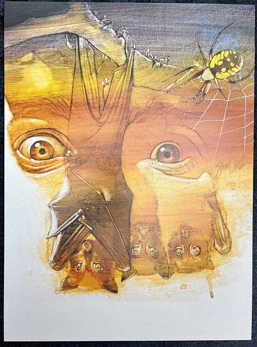
The 1982 Atari 2600 video game, Haunted House, originally produced a pair of prospective covers prior to release, one approved, the other rejected. Both variants share a pair of bulging eyes as major components of their respective designs but are otherwise distinct from each other. This early survival horror title tasks players with spending a night in the titular haunted house, still occupied by the ghost of its former homeowner, who isn't fond of trespassers. What Haunted House lacks in the audiovisual department, it more than makes up for via the artistry of its impressive, hand-drawn cover art, which wouldn't look out of place in the halls or walls of cinemas. The approved cover is a close-up on the pair of eyes, apparently bulging in fear. This is likely an allusion to the protagonist's in-game depiction as a pair of pixelated eyes wandering in the darkness. The warm hues of orange and yellow in the sky suggest the time of day as sunset, further implying the sense of apprehension evoked in those eyes is due to the imminence of spending a night in the haunted house. Juxtaposed over the pair of eyes are a trio of suspended bats, dangling from a tree branch, along which their next-door-neighbour, a spider, patrols its web. While the eyes are an effective design, I lament the absence of the titular haunted house.
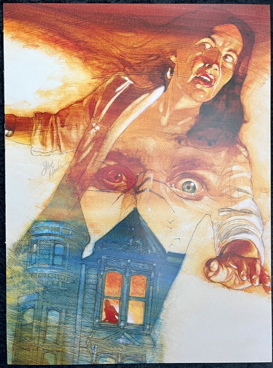
The rejected cover is centered on a terrified woman, glancing in fear at someone, or something, just out of frame. Given her prominence, I assume she's the protagonist. Juxtaposed over her torso is the titular haunted house in all its glory, depicted as a stately Victorian mansion. The silhouette of a woman, likely the protagonist, can be seen peering out an upper floor window. Juxtaposed over the woman's chest are the same pair of bulging eyes from the approved cover, though given their features differ from the woman's, I wonder if they're meant to represent the homeowner's ghost in this design. Of further note, each eye is coloured differently, with one being red and the other green. The former appears to be intertwined with the body of the spider, creating a cool visual effect. The bats, while less prominent than before, are still present, flying above the rooftop of the Victorian mansion. The orange and yellow hues of the sunset are further accentuated by the addition of reds to the palette, which seemingly flow from the woman's hair into the early evening sky. Honestly, I feel the rejected design better conveys the haunted house motif. This cover was reportedly rejected due to the "awkward" placement of the eyes on the woman's chest, though I don't see why they couldn't have simply been relocated elsewhere on the artwork. So, the terrified woman is my pic for this category!
Well, I'm on candy dispensing duty tonight, so I'd best be going to get the candy, jack-o'-lantern, and decorations ready for the trick-or-treaters. I wish you all a very safe and Happy Halloween! Do you have any thoughts on this post? If so, feel free to reach out by leaving a comment, dropping me a line, or signing my guestbook to share your opinions on this or any other topic. Also, feel free to press the "like" button if you enjoyed this post, as "likes" help me gauge audience interest in the content I post. After all, I don't want to bore anyone, ha-ha. Until next time, love, peace, and chicken grease!
Posted in "Random Encounters" on Wednesday, October 31, 2024.

