Cover Art Comparisons' Fifth Symphony (in C Minor)
"Advertising is the art of convincing people to spend money they don't have for something they don't need." - Will Rogers
Hmm, I just realized it's been quite awhile since my last installment of Cover Art Comparisons, so let's remedy the situation, tout de suite!
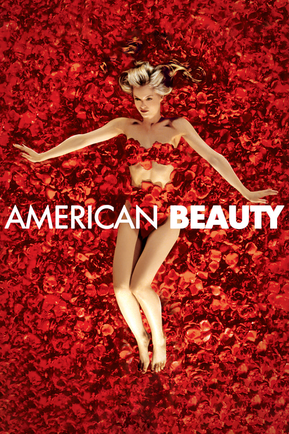
American Beauty, 1999, Belly Button vs. Bed of Roses
Let's kick off our fifth installment of this ongoing series with a look at two movie posters for 1999's American Beauty. As a survivor of assault, I'm well aware of the ugly elephant in the movie, but rest assured, I'm focusing solely on the design and artistry of the posters, not the predator in question nor the film's questionable narrative. Anyway, the first poster offers a close-up of a young woman's belly button (does this count as navel gazing?), with her hand pressing a red rose against her bare belly. As all we see of this woman is her belly button and hand, her identity remains completely anonymous and shrouded in mystery. Whoever she is, she certainly takes excellent care of her skin, as her belly remains devoid of any nevi, angiomas, scars, acne, etc. What's her secret to such flawless flesh? Neutrogena? Anyway, this simple yet effective design has a cool air of mystery about it.
The second poster, which is based on a scene from the film, features Mena Suvari lying naked on a bed of red roses, strategically covering her private parts with said roses. Her crimson lipstick and nail polish match the roses she rests upon, and her overall demeanor seems pretty relaxed, as though lying naked on a bed of red roses is how she typically unwinds after a long, stressful day at school and/or work. Both posters share the same logo, with the only difference being their colour. While neither poster belies the plot of the movie, this design fully reveals the identity of its young woman. So, we have a belly button vs. a bed of roses. Honestly, I prefer the more enigmatic vibe of the first poster. So, the belly button is my pick for this category!
Fun fact: In reality, the mysterious woman's hand and belly button were provided by two different models. The woman's hand belonged to Mad Men star, Christina Hendricks, while her belly button belonged to actress, Chloe Hunter. Pretty cool, huh?
Seattle Space Needle, 1962, and Calgary Tower, 1968, Extraterrestrial Needle vs. Giant Cupcake on a Pedestal
I know, I know...these are tourist attractions, not posters or covers. What can I say? I enjoy upsetting the status quo! Anyway, I've only ever visited Calgary once, when I was about 12-years-old, and have never been to Seattle (I'd love to visit someday, though!), so I'm comparing these two touristy towers strictly from an architectural standpoint, rather than analyzing which of them offers tourists the better view/experience. I dig the Space Needle's retrofuturistic Googie aesthetic of the early 1960s, complete with the latticework of its shaft and the flying saucer-inspired observatory. Very cool and Jetsons-esque.
The Calgary Tower's concrete shaft is rather bland, though its observatory has an interesting cupcake-like shape to it, and its vibrant red hue would certainly draw my gaze upwards towards its pinnacle. So, we have an extraterrestrial needle vs. a giant cupcake on a pedestal. Honestly, I prefer the Space Needle, as it feels more artistic in its design, whereas the Calgary Tower comes across as being more utilitarian. So, the extraterrestrial needle is my pick for this category!
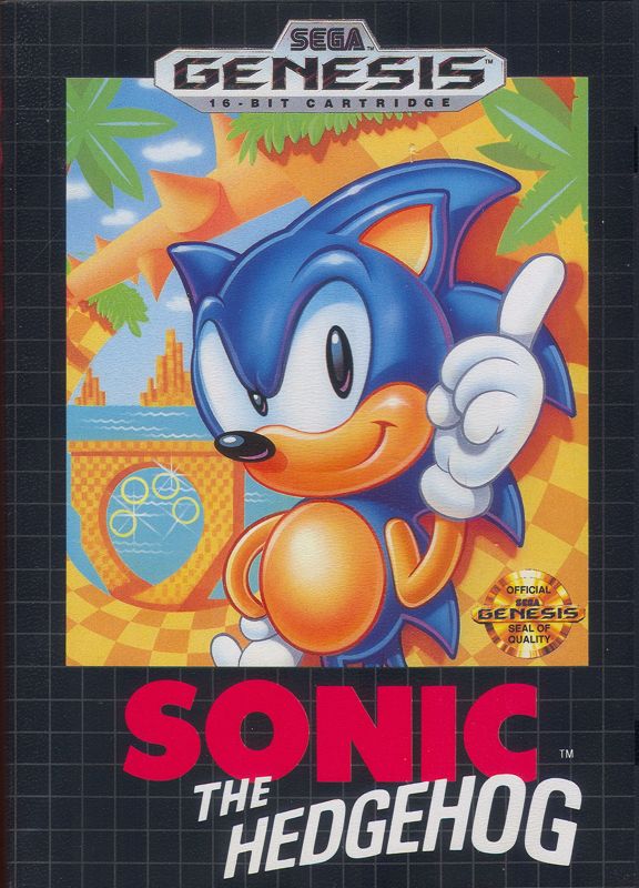
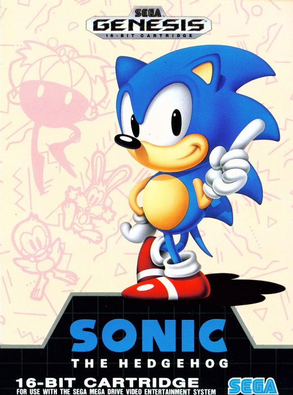
Sonic the Hedgehog, 1991, Body Oiled, Suntanned, and Mohawked Sonic vs. Clearer, Sharper, and Vibrantly Vivid Sonic
Next up, are two covers for 1991's Sonic the Hedgehog, one by Greg Way, released exclusively in the US, and another by Naoto Ohshima and Akira Watanabe, released here in Canada, as well as Europe and Brazil, a variant of the original Japanese cover. Both depict Sonic in his famous finger-waving pose, but with differences in his design. In Way's cover, Sonic has slathered body oil all over himself, sunbathed, and styled his quills into a mohawk. Sonic is solely depicted from the waist up in Way's cover, resulting in the notable absence of his long skinny legs, white socks, and red and white sneakers, all major aspects of his persona. As such, Sonic's trademark propensity for running at maximum velocity is neither represented nor hinted at, which was a major missed opportunity. The background details of Green Hill Zone are beautifully illustrated and depict the levels' iconic features, such as checkered dirt, a loop-de-loop, and a rotating spiked long.
In Ohshima and Watanabe's cover, Sonic has ditched the body oil, sunbath, and mohawk. This time around, Sonic is seen in all his glory, with his long skinny legs, white socks, and red and white sneakers being front and centre, a wise design choice. Sonic is depicted in very clear, sharp, and vivid detail, with vibrant colours that really pop. The background consists of a beige void adorned with doodles of Dr. Robotnik, Sonic's animal buddies, and various scribbles, squiggles, and shapes, giving this background a cool hand-drawn sketchbook aesthetic. The colour and typography of the logos are distinct from each other, with Way's design being the more recognizable of the two. So, we have body oiled, suntanned, and mohawked Sonic vs. clearer, sharper, and vibrantly vivid Sonic. Perhaps I'm a little biased, having grown up with the cover art released in Canada, but I genuinely prefer the charming aesthetic of Ohshima and Watanabe's artwork. So, the clearer, sharper, and vibrantly vivid Sonic is my pick for this category!
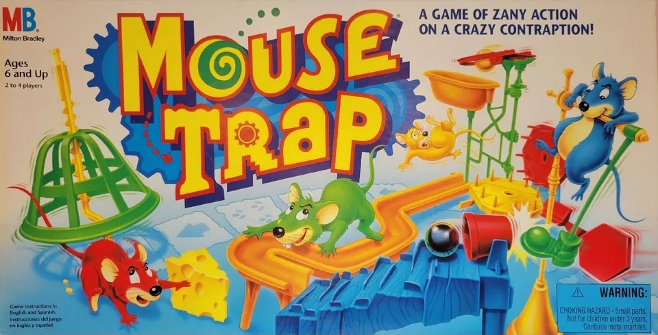
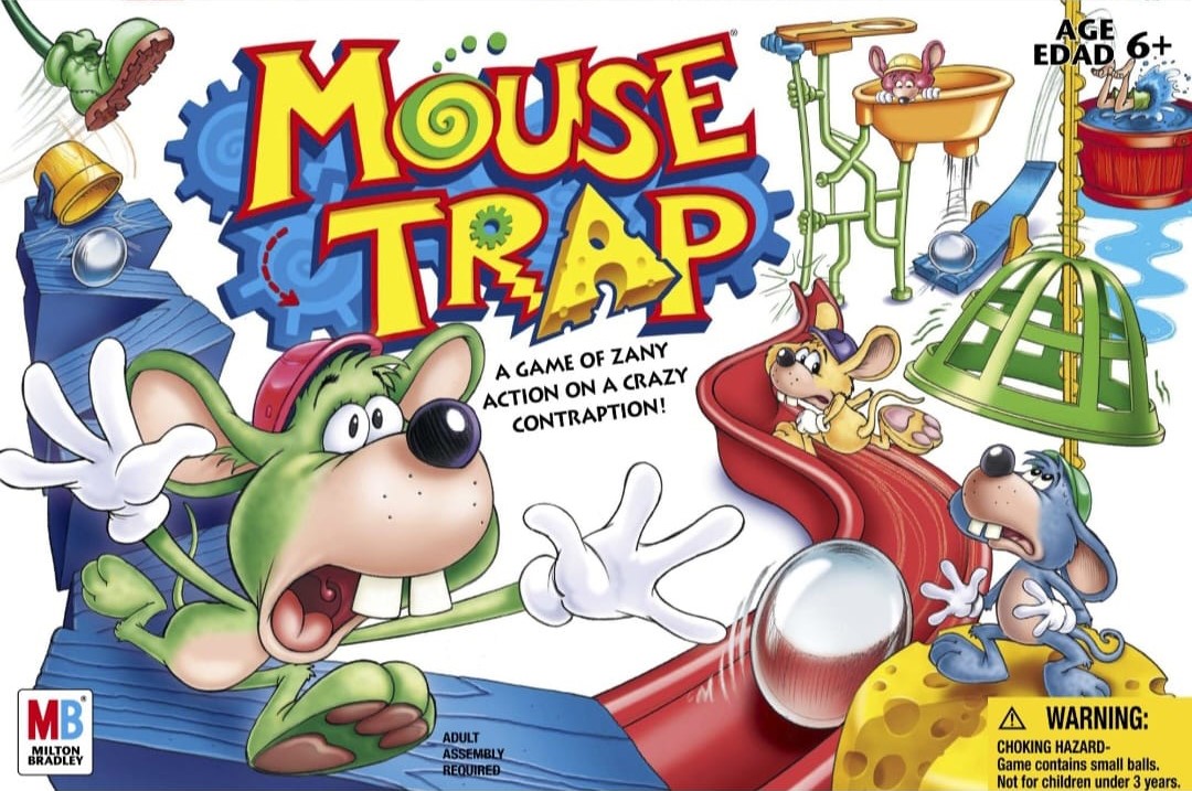
Mouse Trap, 1963 (1999 and 2005 Editions, Covered), Cute and Anatomically Correct Mice vs. Goofy and Cartoony Mice
Here, we have the 1999 and 2005 editions of Mouse Trap, that zany children's board game modelled after a Rube Goldberg machine. Both covers feature the four multicoloured mice attempting to navigate the crazy contraption while escaping their respective predicaments. In the 1999 edition, Red is snatching a wedge of Swiss cheese while sliding out of the net's radius, Yellow is plunging off the rub-a-dub tub, Green is scurrying along the chute, and Blue is giving the marble the boot. The 1999 cover depicts the tiny rodents in a cute, anatomically correct fashion, reminiscent of what you might find in one of Disney's animated feature films. While Yellow is understandably terrified to be skydiving without a parachute, Red, Blue, and Green exude an air of determination in the 1999 cover, remaining calm, cool, and collected. They're even bold enough to cheekily smile in the face of imminent danger, as if saying; "not today!" to the titular trap.
For the 2005 cover, Red, Blue, Green, and Yellow received much goofier and cartoony makeovers, complete with white gloves, Toontown's trendiest fashion accessory. In their new wacky forms, the mice could easily secure work as background extras in Looney Tunes shorts. This time around, all four of them look equally terrified and far less confident in their chances of escape. Both Green and Yellow are attempting to outrun a pair of marbles, a la Raiders of the Lost Ark, Blue is petrified as the net closes in, and Red is cowering inside the rub-a-dub tub. Both logos are quite similar, with the biggest difference being the clever addition of a triangular wedge of Swish cheese as the letter, "A" in the 2005 design. So, we have the cute and anatomically correct mice vs. the goofy and cartoony mice. While the cute mice are super charming, I feel their goofy counterparts better suit the wacky tone of this silly board game. So, the goofy and cartoony mice are my picks for this category!
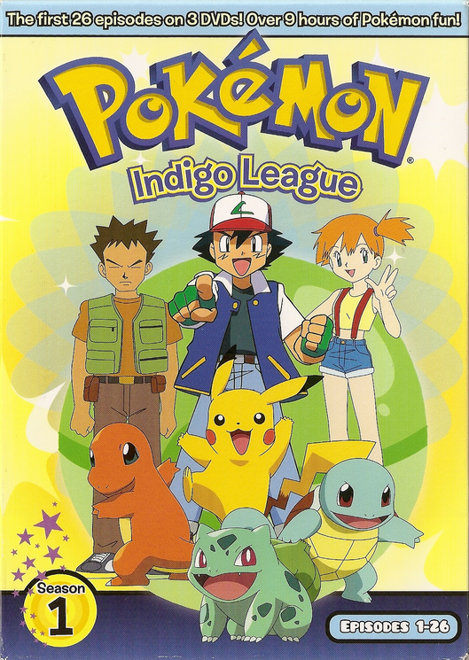
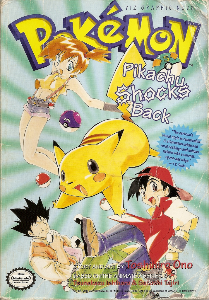
Pokémon, 1997, Static Ash, Misty, Brock, and Pikachu vs. Lively Ash, Misty, Brock, and Pikachu
Let's conclude this installment of our ongoing series with a Pokémon battle between the 1997 anime and manga. The combatants will be the Indigo League DVD cover vs. the Pikachu Shocks Back manga cover ("Cover wants to fight!"). Both covers share the same logo, with the only discernable difference being their respective shades of yellow. Likewise, the cast's clothing remains essentially the same across mediums. Ash is sporting a baseball cap, sleeveless jacket, T-shirt, fingerless gloves, and jeans. Misty is rocking a crop top, suspenders, and denim short shorts. And Brock is decked out in backpacking attire, consisting of a vest, T-shirt, and jeans. The cover features Ash, Misty, and Brock hanging out with Pikachu and the original three starter Pokémon. The anime's colours are nice and vibrant, but the cast's postures are rather static, appearing as stiff and wooden as a Sudowoodo. As a result, this artwork lacks a sense of motion and fluidity that would've animated the anime.
In contrast, the manga's cast are striking much livelier poses, with plenty of movement and action between the four of them (the three starter Pokémon were on vacation and missed this photo shoot). The background's impact effect further enhances this flow of movement and great sense of action. I also love the prominence of poké balls on this cover. Ash has added a pair of sturdy hiking boots to his wardrobe, perfect for travelling across the land (searching far and wide!), and his new crimson jacket matches the one worn by Red, his Game Boy counterpart. Misty has added a stylish new belt to her repertoire, and her crop top now shows off her belly button. And Brock has changed the colours of his backpacking attire, while also stuffing his pockets and face with yummy "jelly donuts" (his favourite!). So, we have static Ash, Misty, Brock, and Pikachu vs. lively Ash, Misty, Brock, and Pikachu. Honestly, I prefer the more action-packed vibe of the manga cover. So, lively Ash, Misty, Brock, and Pikachu are my picks for the closing category!
Fun fact: The Pokémon manga was apparently targeted at an older audience than the anime, as it contained blood, mild profanity, and risqué material that was censored outside of Japan. Nothing M-rated, mind you, but certainly T-rated. Pretty cool, huh?
That's all for now, but I'll definitely be back with more Cover Art Comparisons soon! Do you have any thoughts on this post? If so, feel free to reach out by leaving a comment, dropping me a line, or signing my guestbook to share your opinions on this or any other topic. Also, feel free to press the "like" button if you enjoyed this post, as "likes" help me gauge audience interest in the content I post. After all, I don't want to bore anyone, ha-ha. Until next time, love, peace, and chicken grease!
Posted in "Random Encounters" on Saturday, October 19, 2024.
